
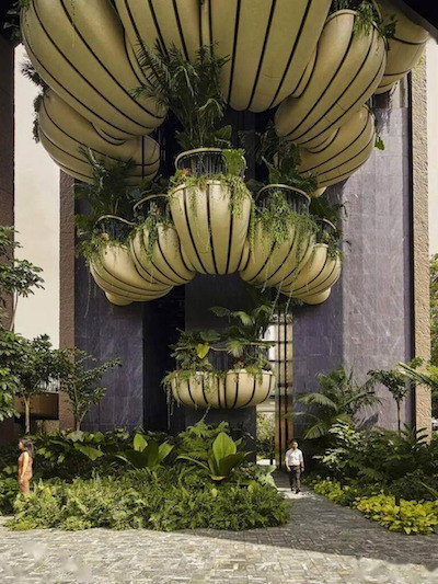
Embracing Biophilic Design
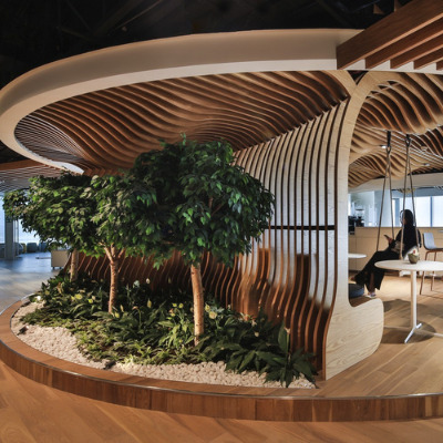
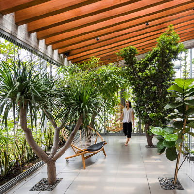
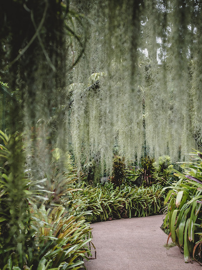
Our homes and workplaces should be spaces that make us feel closer to nature, experience a connection to our environment and recognise the importance of our overall wellbeing. In the last couple of years, biophilic design has become much more popular: it’s not simply adding a pot plant or two, or incorporating a living wall, it’s an entire energetic tonal movement. Incorporating direct or indirect natural elements into a design requires consideration when designing a space; be it natural materials, natural light, vegetation, outdoor views and sometimes even sensory cultural symbols, all of these increase one’s connection with our natural environment.
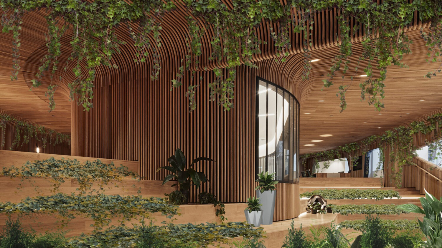
Biophilic design not only creates a sense of harmony between indoor and outdoor spaces. Research has shown that incorporating biophilic elements, such as the installation of a circadian lighting system, can improve productivity and reduce stress. Moreover, biophilic design symbolises the notion of embracing ideas, not dominating them; greenery in any form can feel both transformative and natural, and incorporating green in different media echoes the need for balance and calm equilibrium in our lives.
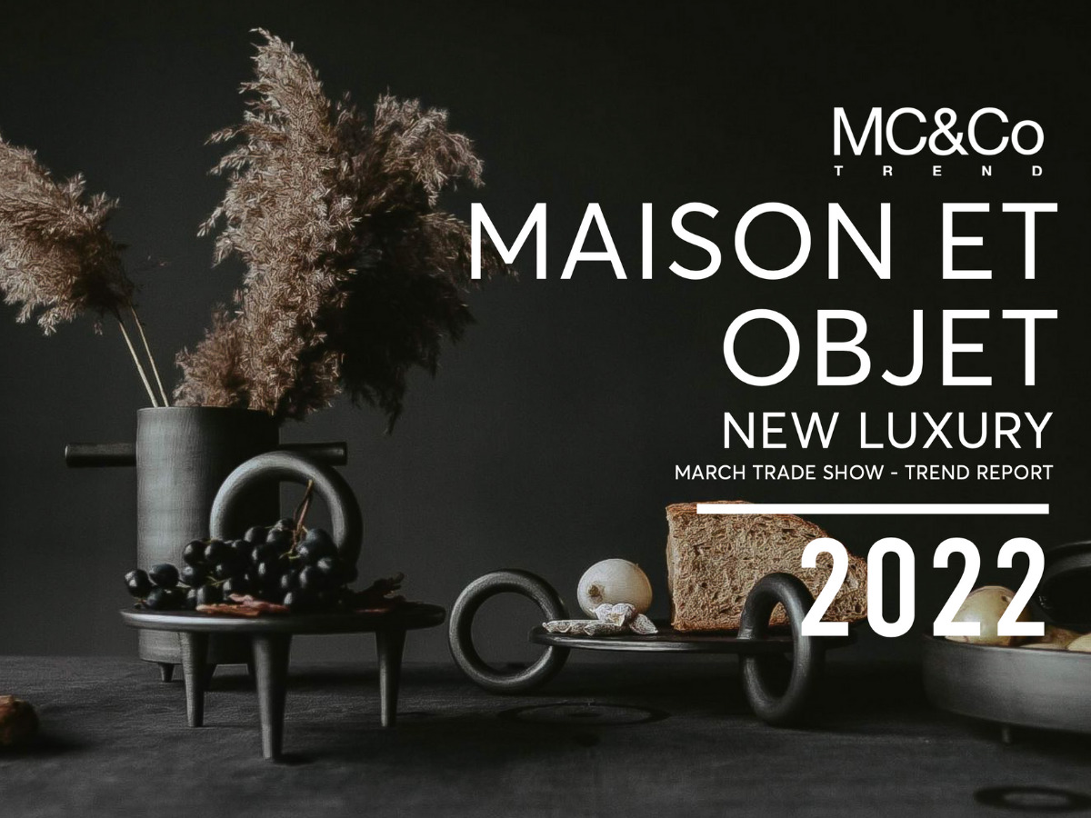
Previously, in last year’s Colour Report, we forecasted on six new tones of green: Frosted Mint, Apple Green, Baby Mint, Kelp, Jade and Lime, and in our recently released Maison et Objet Report, we realised how our colour predictions were spot on.
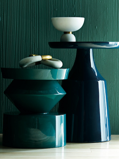
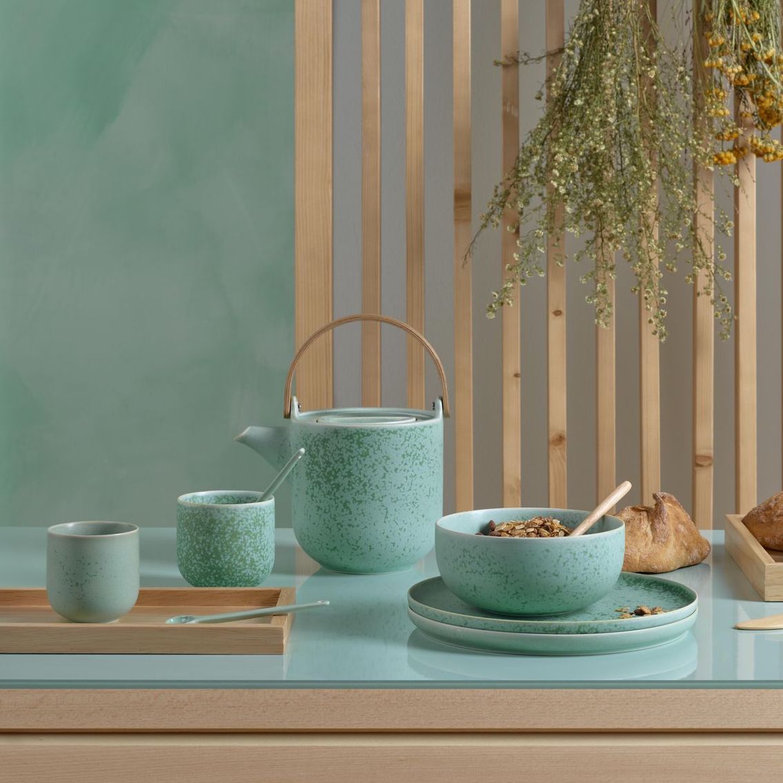
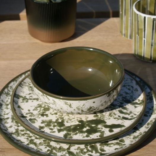
In March 2022, at the first of Maison et Objet’s biannual presentations, we saw a multitude of green hues manifested into a wide variety of tangible design pieces crafted by leading Design Studios. It is noteworthy that greens were chiefly prominent in ceramics; incorporating green in such everyday objects underpins the endorsement of wellness design and acknowledges the impact design has on our lives.
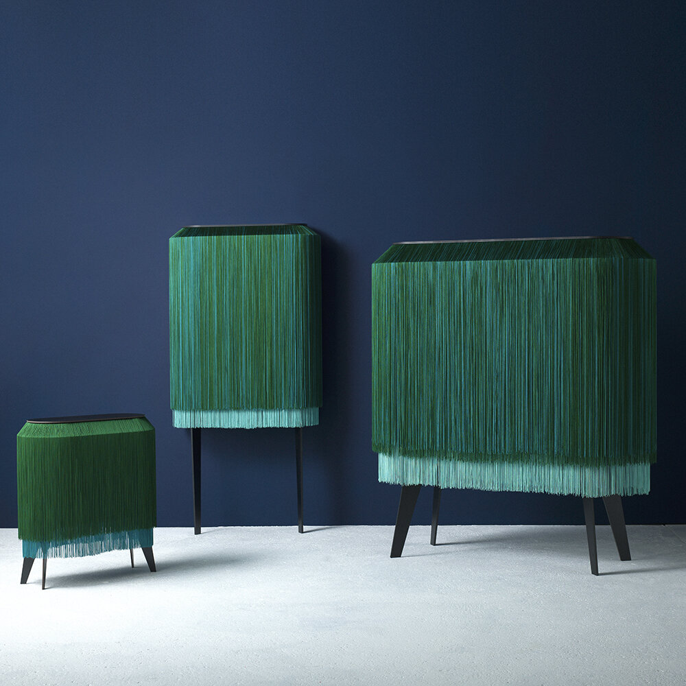
In the MOM Village, Rachel & Benoit Convers’ Alpaga Collection for the French brand Ibride explored open cabinetry with luxurious vibrant Emerald and Jade fringing adding a sense of mystique and fluidity to the exquisitely elegant Lady Alpaca cabinet. Though not flora-like in any form, there is something about the movement of the fringing which feels very organic and you just want to reach out and touch it, it’s the feeling of connection which really encompasses the beauty of the collection.
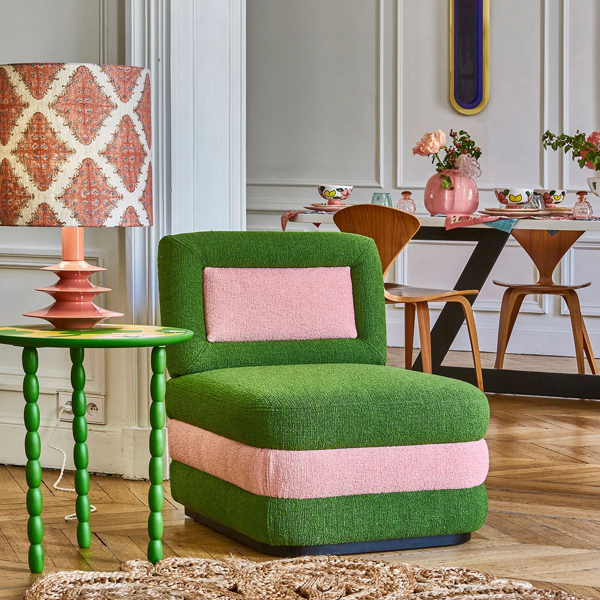
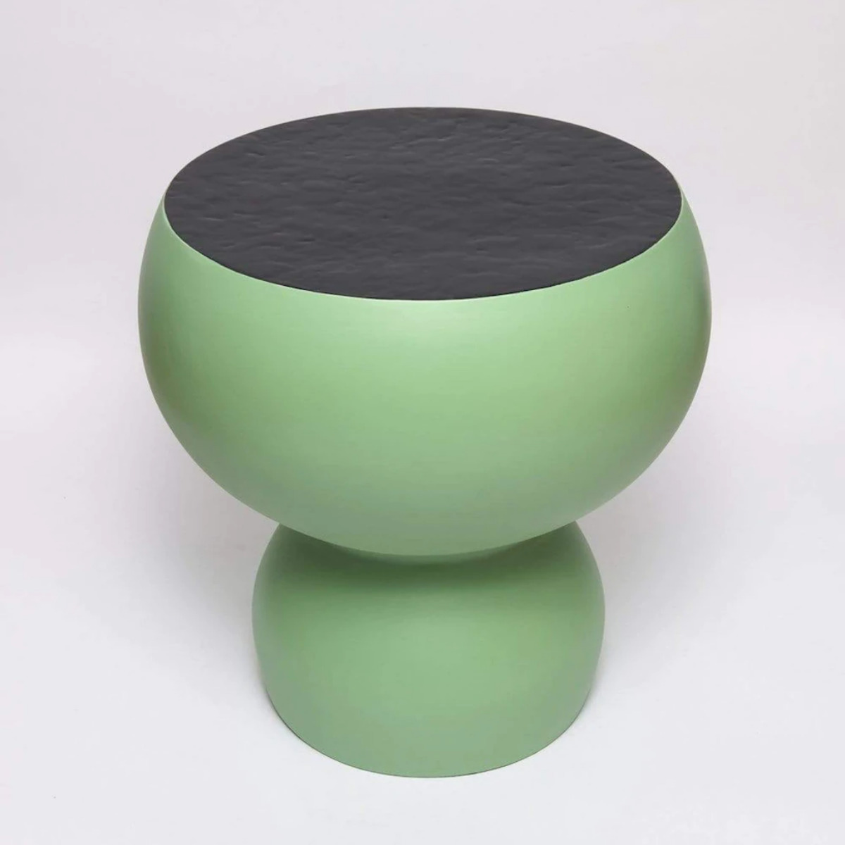
As part of the Maison et Objet “In the City” event, Studio Maison Matisse launched their ceramic Alto Side Table, inspired by Henri Matisse’s painting of the same name. The table base in a matte finish in an arsenic hue similar to our Tea colour contrasts beautifully with its reflective black top. Also at Maison et Objet, Popus Editions launched their Veronica Chair which was inspired by Californian nature. The crisp Apple hue paired with its complementary pink appears to float mysteriously; it is fun, crisp and a welcome splash of colour.
Our expectation that Seaweed and Kelp tones would be prominent was widely manifested at Maison et Objet throughout our four Approaches to Life: Optimistic, Ambitious, Disciplined and Accomplished. Furthermore, this only illustrates that the green movement, and more specifically, biophilic design, not only continues to flourish, but moreover, is a massively cross-cutting theme which reiterates that the transition between our interior and exterior spaces have become ultimately more fluid-like. Biophilic design isn’t a short-lived trend. Over time its wellness benefits will be recognised as a valuable and integral part of our lives.
Overall the brighter the hue, the more uplifting and energising, helping us feel inspired and refreshed.
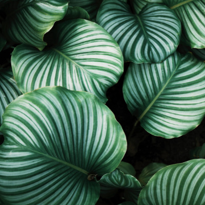
Green, the colour of vitality and life, with its healing powers is considered to be the most restful colour for the human eye to see. Therefore it is not surprising that green hues are again popular throughout all design disciplines.
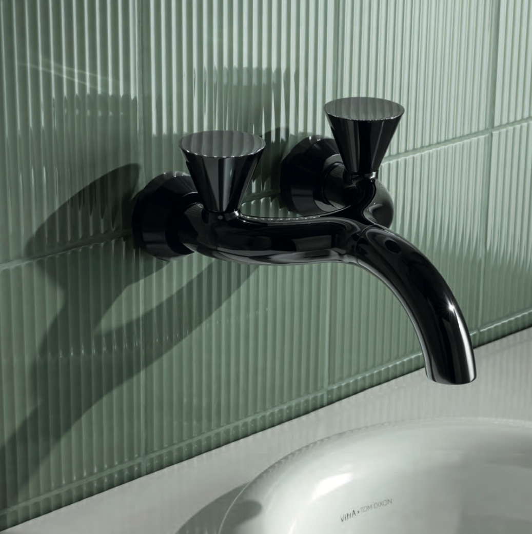
Whoever thought there could ever be an avocado-coloured bathroom revival movement, but it’s here! Tom Dixon collaborated with Vitra to create their Liquid Bathroom range, these Eucalypt coloured tiles are quite a statement.
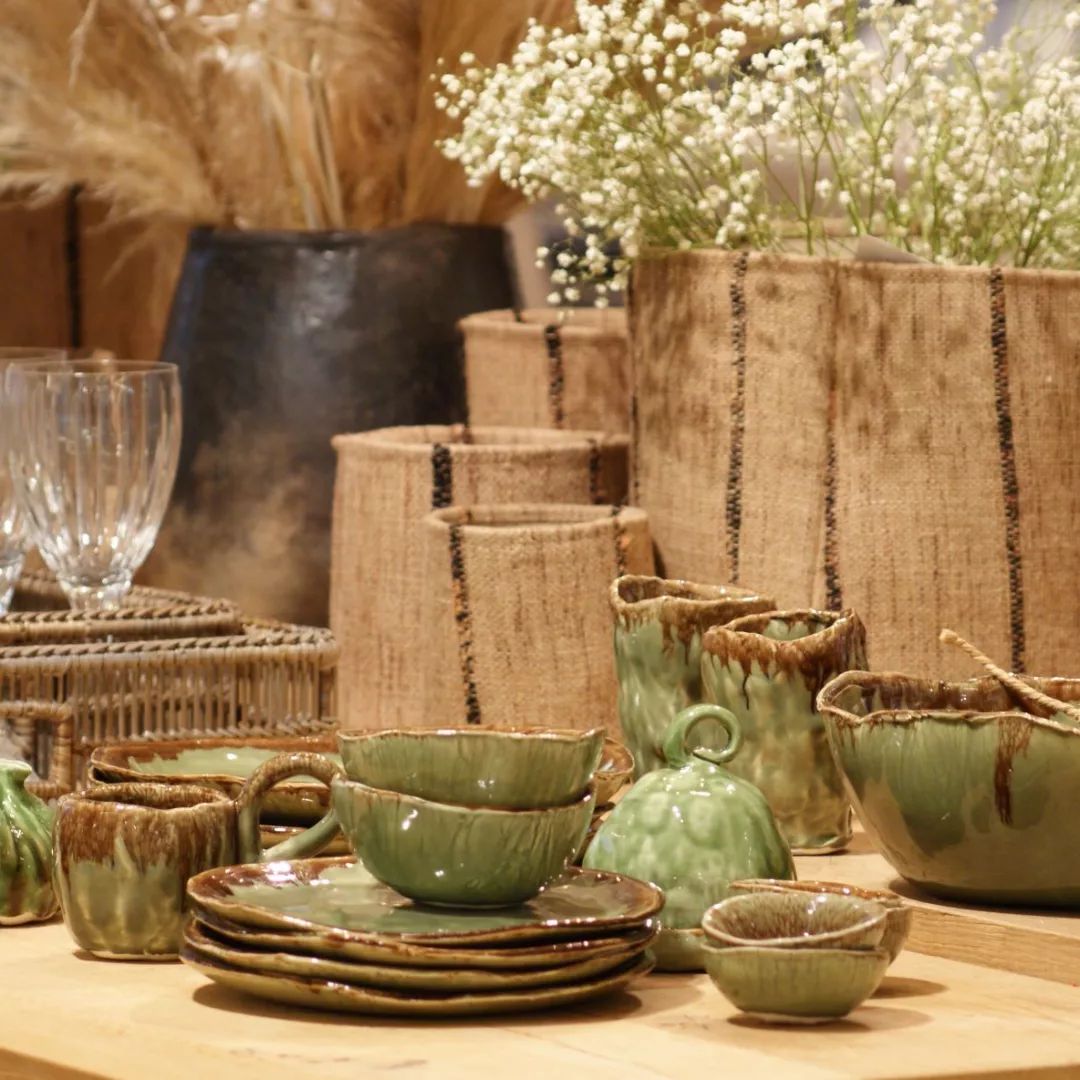
At Maison, Flamant Jacques launched their new collection where they cleverly incorporated Kelp and Pea hues into their new earthy new ceramic range, creating some exquisite ceramics which truly resembles foliage. The way they have used chocolate brown tones adds to the richness of the palette. They also used the Kelp with an ecru which feels so organic and curated.
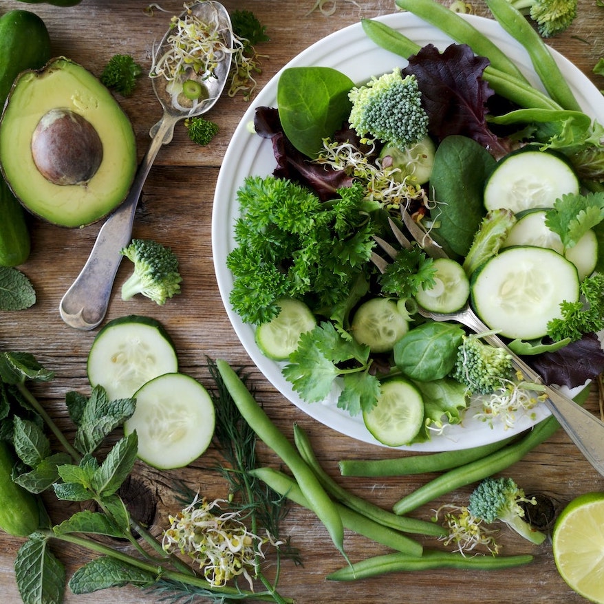
Many of us are urban dwellers and spend a large proportion of our lives indoors: we work indoors, exercise in gyms, eat inside, and are on the fast-living conveyor belt, so naturally we become disconnected to nature. Some of the positive consequences of the pandemic included slowing down, appreciating crafted natural element objects; reflecting on what we were eating; examining how many fruit and vegetables we consumed, since we all know that healthy eating leads to healthy living.
We already knew that eating a diet rich in greens would probably benefit our health, but our habits were such that we rarely took time to implement life changes, to think more holistically, to slow down. Recently, there has been an resurgence in the popularity of allotments in urban areas, echoing the trend to grow our own produce: even growing herbs on a window sill can be both therapeutic and tasty! That uplifting sensation of seeing the first shoots of Spring is quite special, symbolizing new life and the future.
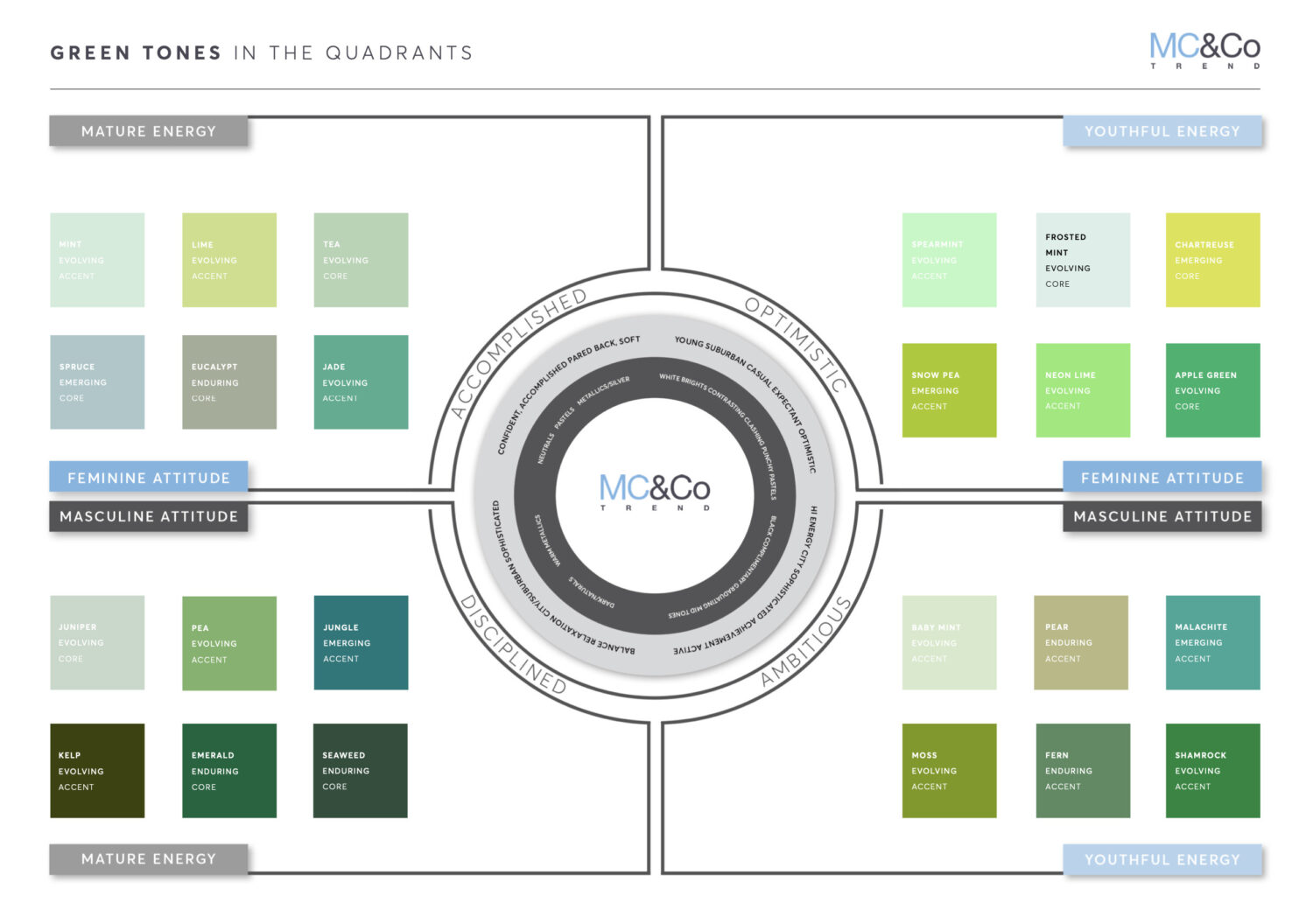
In our 2023-2024 Colour Report, we elaborate on how the green family is expanding into blue-greens and yellow-greens in terms of emerging trends. We forecast five new emerging shades: Spruce, Snow Pea, Chartreuse, Malachite and Jungle.
Here we illustrate how green is represented throughout our four quadrants, using our MC&Co Trend Intelligence System, which accurately targets one’s audience.
Whether eating off green tableware, displaying nature-inspired vessels, incorporating foliage-centric or upholstery fabric in nature’s most prominent colour, we will be enriching our environment by using nature’s hallmark colour which evokes renewal, restoration, signifies life and brings harmony and positively influences our emotional state of mind, so give green a chance!
About the author, Naomi Scott-Dune:
Naomi is an experienced Interior Designer with a demonstrated history of working in the design world, as well as skilled in Conceptual Design, Creative Concept Design, Corporate Protocol and Etiquette, Art Direction, and Adobe Creative Suite. Naomi is also a strong arts and design professional with a Diploma of Education focused in Interior Design from KLC School of Design. She is a published copywriter, specialising in colour psychology, history of styles and trend forecasting.