Stop It With This Colour Of The Year Nonsense
I don’t agree with companies releasing ‘the colour of the year’… THERE- I said it! I find that product developers and buyers take it too literally, and how much ‘Classic Blue‘ can one room take?
Each year I find myself asking ‘How can one colour determine a season?‘. There are so many different ways colour is used between products- both physical and digital. Colours of the year for 2021 are soon to be released from Pantone, Shutterstock and WGSN who all have their colour, or, colours.
Behr paints and Benjamin Moore in the US for Dulux in Australia, all try to show their expertise and leadership by showcasing one colour or a series of up to 6 colours as THE colour that will be in fashion for future seasons. Whilst I admire and respect all of these organisations, predicting the colour of the year, in my opinion, is just plain nonsense.
Last year Pantone named Classic Blue as ‘the colour of the year’, Shutterstock said Lush lava, Aqua, Menthe and Phantom Blue (not classic blue). WGSN and Coloro said 5 colours were IT– Purist Blue (not Phantom or Classic) Neo Mint, Cantaloupe, Mello Yellow and Cassis. Clearly, Blue is the colour for 2021.
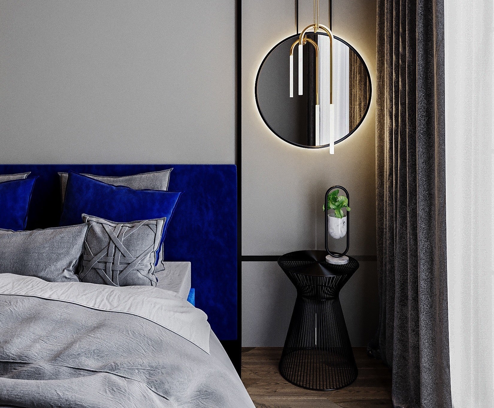
Let us look at blue in 2020. Blue in Print was very different from blue used in the digital space. It was different in more youthful and energetic values than what it was in more relaxed and calming palettes. There were many commercial and appropriate blues shown and sold in the market in 2020.
When it comes to assessing and forecasting Interior colour trends, we recommend thinking about this…
Any colour needs to be addressed in terms of tones. Tones for the appropriate style of decoration. We place all colour into 4 quadrants of approach to life.
- Young Optimistic, youthful expectant
- Active achievement orientated vigorous and ambitious
- Calming, balanced, relaxed and calming
- Accomplished, luxe, pared back
When it comes to blue 12 Important tones have been commercially successful this year. Some are core colours, some accent. Some are enduring, some are emerging. They are all important and valuable when used within the appropriate scheme.
Using our style quadrants and approach to life, it is clear that one blue cannot define a season. Shown here on our Trend Intelligence Wheel which you can find in our 2021 Colour & Interior Trend Forecast Report.

What is important when thinking about colour is the alignment of tone to makes it commercially successful.

And dont even get me started on pink…
