Trends vs Classics:
How do design classics stand the test of time? Read on…
One of the most significant takeaways from this year’s Milan Design Week was the use of materials, such as steel, wood and stone. Undoubtedly, these resources are by no means new; yet they have undergone special treatments, using current technologies, making them more malleable and versatile for use in today’s contemporary designs. Materials from all around the world are being adapted and crafted into innovative forms, and the use of colour within these materials was widely referenced in Milan Design Week. There was a palpable appreciation of the heritage of design classics by Le Corbusier, Bertoia and others from the Modernist movement, with today’s designers undoubtedly inspired by the formers’ iconic pieces, re-interpreting them with a modern twist. We saw a resurgence of polished tubular steel, concrete, leather and wood – a nod to the Modern movement, but more of a softer brutalism.
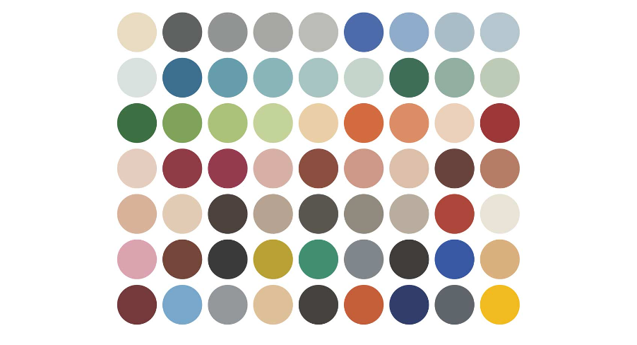
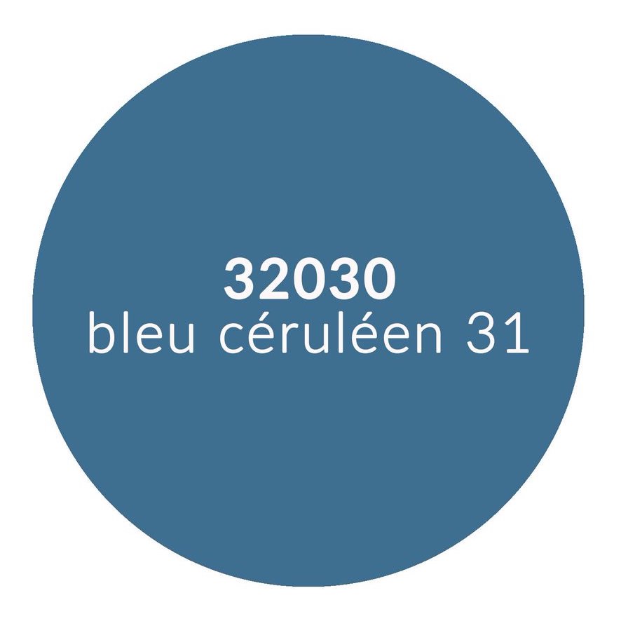
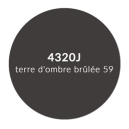
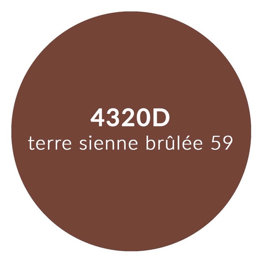
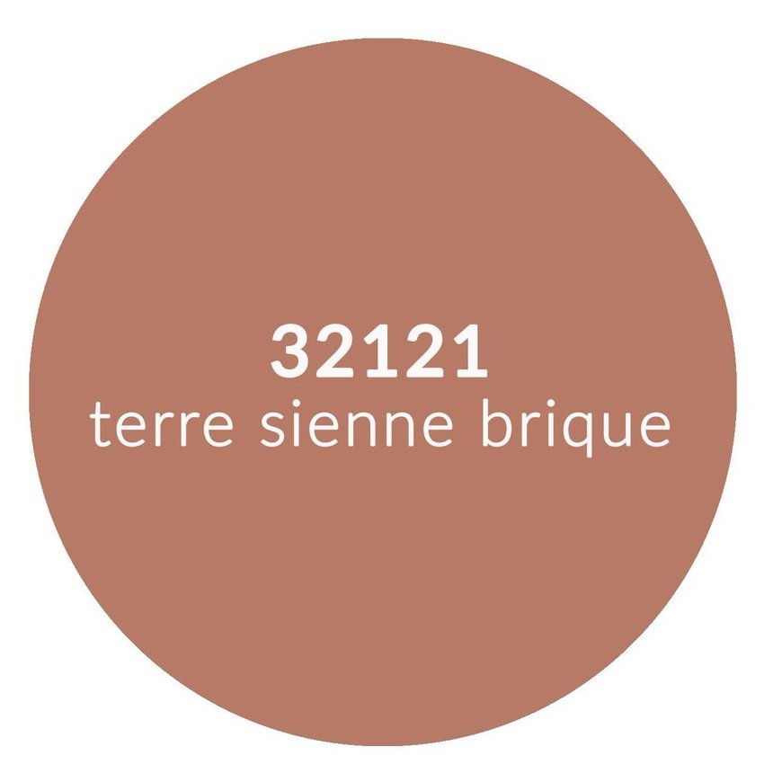
Being considered relevant in the design world is such an important factor, and as a follow-on to seeing today’s designs inspired by iconic classics, we contemplated Le Corbusier’s visionary Architectural Polychromy, which comprises 63 architectural colours created by Le Corbusier in two colour collections: his first collection created in 1931 contained 43 highly pigmented shades; his second, more vibrant collection, from 1959 includes a further 20 shades. This is a masterful collection of hues which will never be either expanded nor updated, so we questioned how do these 63 colours continue to be enduring and, moreover, relevant in today’s designs. Perhaps the short answer is that these carefully considered pigmented hues continue to be as significant and relevant today as they ever were, since they were inspired by nature, designed to all work in harmony together, to be timeless and never be out of fashion.
“63 colours continue to be enduring
Our curiosity then led us to make a comparative analysis of Le Corbusier’s Architectural Polychromy, with our current Colour Forecast Report and our report on Milan Design Week 2022. In our Colour Report, we define enduring tones as colours which have maintained a general aesthetic over a long period and become an everlasting style; architects, interior designers and colour aficionados would agree that Le Corbusier’s Architectural Polychromy falls under a very similar description. MC&Co’s Trend Intelligence System contains six vital aspirational segments – identifying emotional drivers. In this exercise we looked closely at three of these six Aspirations: Opulent (Luxe Life), Ordered (Structured) and Grounded (Calm). Furthermore, out of our four Approaches to Life, we selected the Disciplined Approach to Life – Mature Energy/Masculine Attitude – balanced, relaxation, city/suburban, sophisticated.

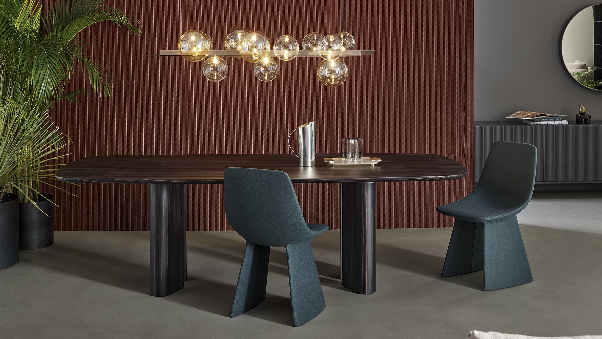
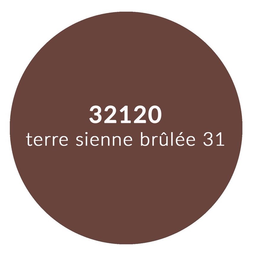
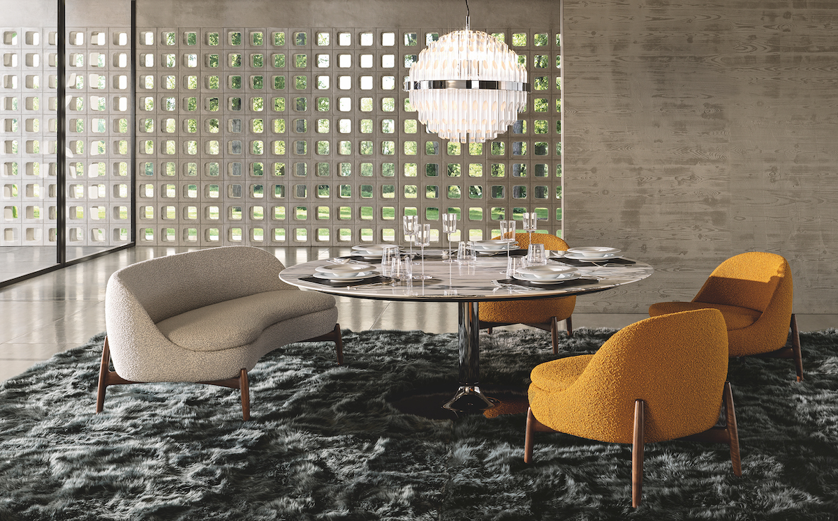
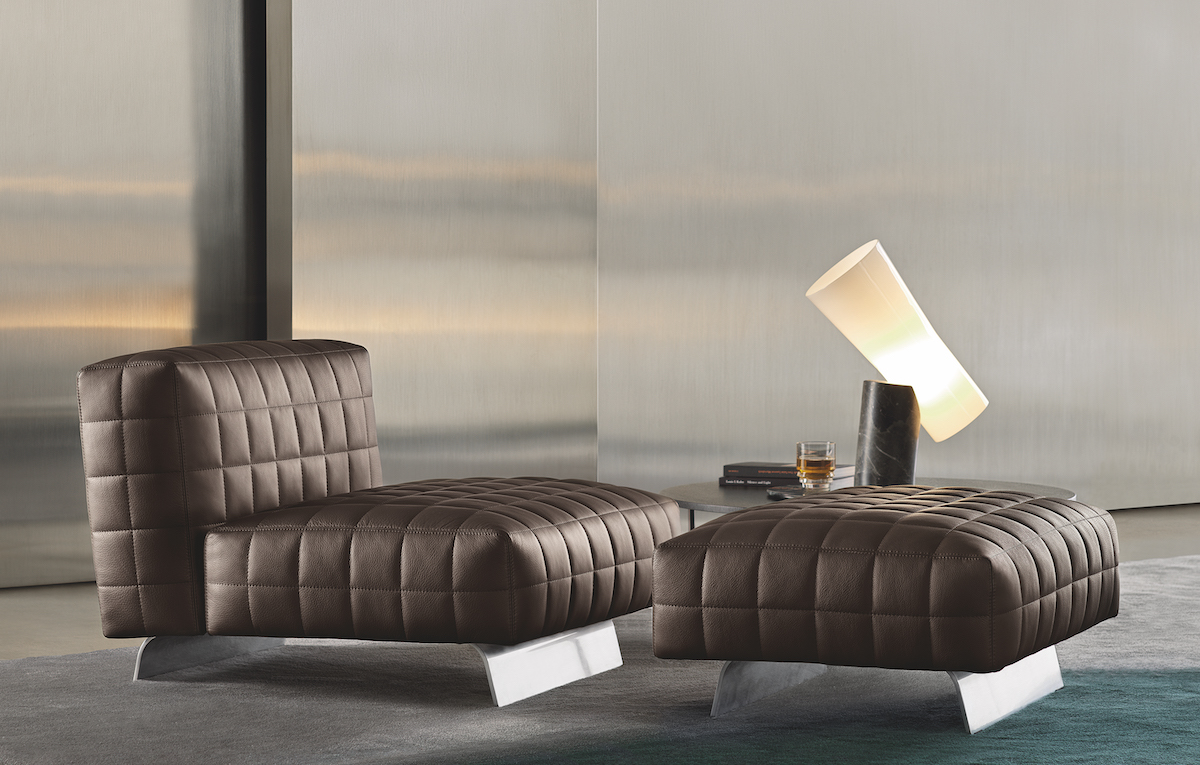
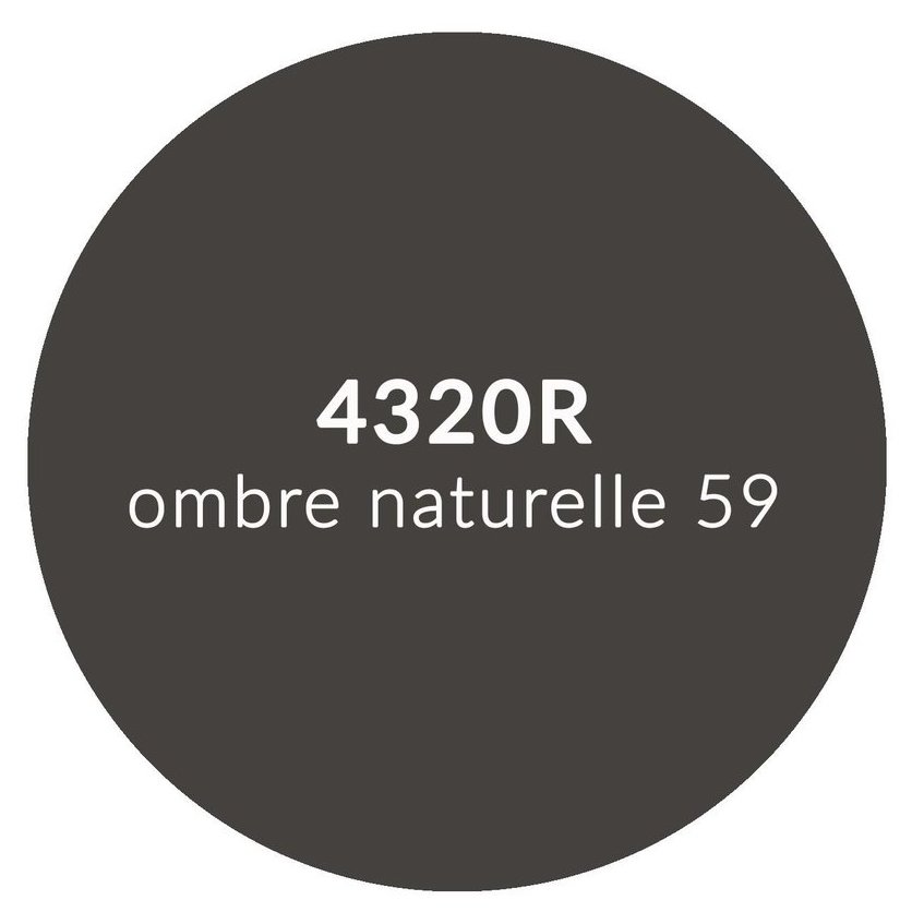
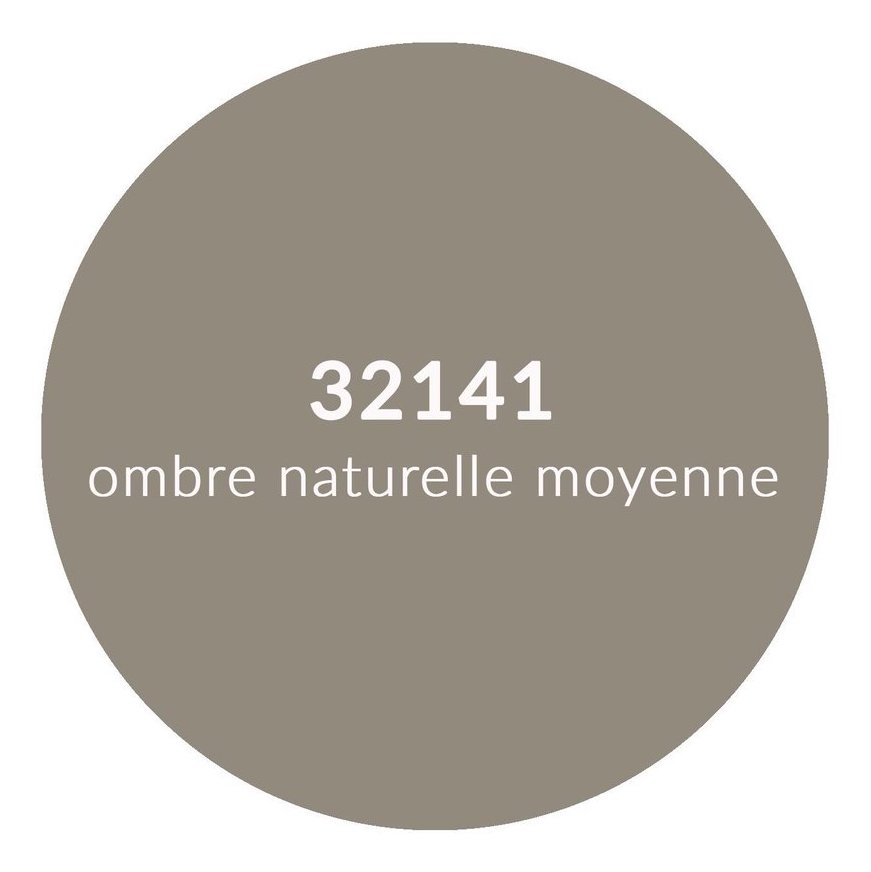
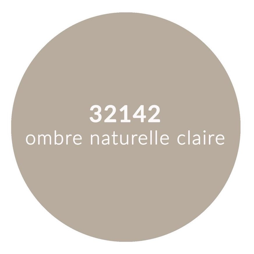
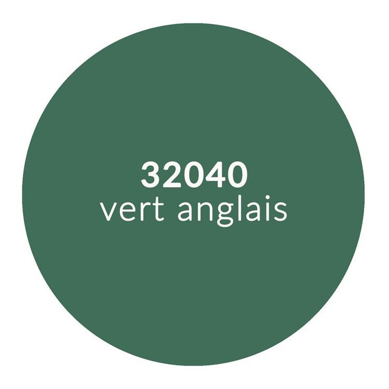
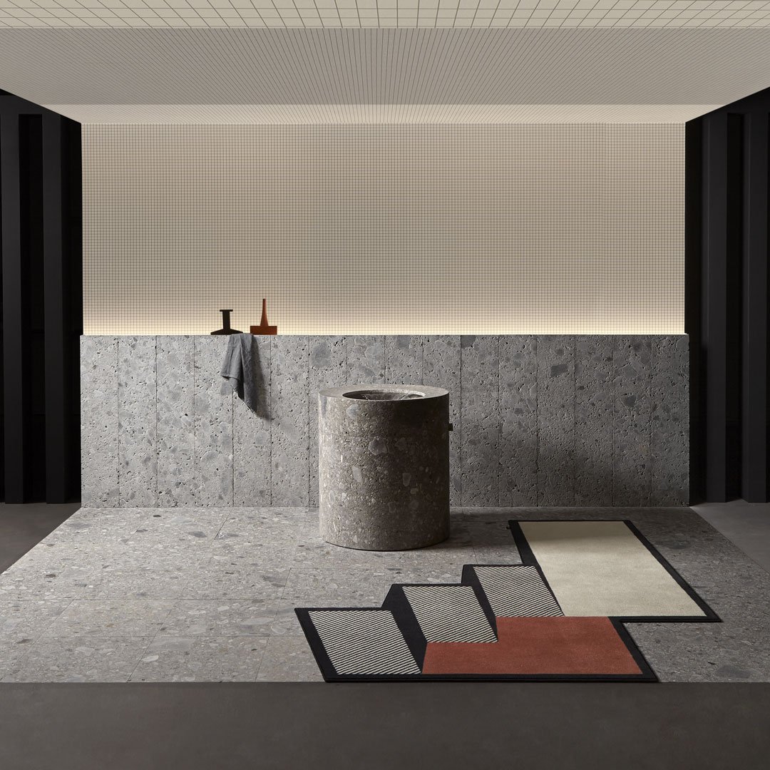
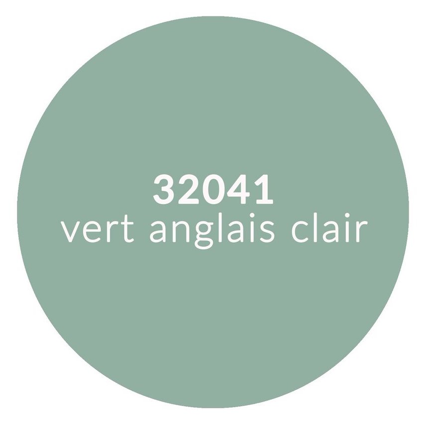
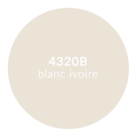
In Milan, Bonaldo launched a collection which was inspired by Brutalism – Le Corbusier’s Unité d’Habitation is arguably one of the best examples of Brutalist architecture, and Bonaldo’s chair, The Agea, their take on the iconic Eames chair, the Olas, and their entire palette, was in line with the earthy colours in Le Corbusier’s Architectural Polychromy. It is also noteworthy that Bonaldo offers an eco leather finish for the monolithic Agea chair. Below are some of the Le Corbusier colours which are harmonious with Bonaldo’s new collection, so here it is both the form of the pieces, their materials, and their colour palette options which almost animate these hues from the Architectural Polychromy.
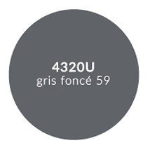

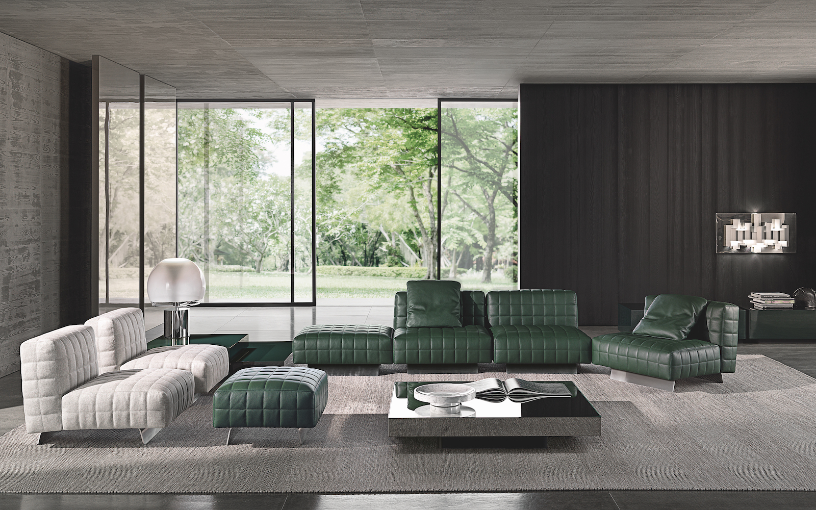
Then when we looked at Minotti’s collection in Milan, which has a very dark masculine feel, a tonal grey and neutral palette with injections of dark green and a golden yellow which was interestingly used in a bouclé fabric. For their new Twiggy chairs they combined aluminium legs – either polished or with a black varnish with an intricately stitched leather or fabric. Again, the colours are almost Le Corbusier colours – but the contemporary design makes the colours feel so relevant, and the choice of materials is cutting edge. Also in some of their press shots the background resembled béton brut – the raw concrete – of whom Le Corbusier was the main pioneer.

In March 2022, at the first of Maison et Objet’s biannual presentations, we saw a multitude of green As a third example we looked at Antonio Lupi, where his latest collection expressed quite fluid shapes in natural materials. His use of texture is so thoughtful and the innovative use of conventional items utilized in an unconventional way – as we mentioned earlier incorporates clever twists into his designs. Again, his choice of materials, béton bru-esque concrete, honed stone, neutral ceramics is a simple palette which feels grounded, harmonious and intended. Several of Lupi’s bathroom designs reminded us of the bathroom that Le Corbusier designed as a sanctuary at Villa Savoye in Paris, with its tiled chaise-longue, tiled sunken bath in a fully tiled room with light flooded through the skylight.
Le Corbusier believed that there was an inherent order in nature, he spoke of a reconciliation with nature. It’s thought-provoking that of the three aspirational segments we examined, ordered was one of them. Le Corbusier believed that it was important to properly understand the natural order and how we should work in harmony with it. He based much of his approach to colour selection on the effect colours had on humans, so there are many parallels between the science behind Le Corbusier’s Architectural Polychromy and MC&Co’s Trend Intelligence System.
In summary, it is quite intriguing that of the three case studies we undertook, 14 of the pigmented hues from Le Corbusier’s Architectural Polychromy featured in the new collections launched in Milan this Spring. This indicates that Le Corbusier’s 63 colours are not only both relevant and respected, but are actively incorporated into cutting edge contemporary designs, and integrated into today’s materials using modern technology. We are quietly confident that if Le Corbusier were alive today, he would advocate the use of our scientific Trend Intelligence System, he’d probably have limited edition capsule collections and be a global colour influencer!
To learn more about any of our reports please click on the links to our website.
About the author, Naomi Scott-Dunne:
Naomi is a part of the MC&Co trend team. An experienced Interior Designer with a demonstrated history of working in the design world, Naomi is skilled in Conceptual Design, Creative Concept Design, Corporate Protocol and Etiquette, Art Direction, and Adobe Creative Suite. Naomi is also a strong arts and design professional with a Diploma of Education focused in Interior Design from KLC School of Design. She is a published copywriter, specialising in colour psychology, history of styles and trend forecasting.