Stop It With This Colour Of The Year 2021 Nonsense
For over 20 years, Pantone’s Colour of the Year has influenced product development and purchasing decisions in multiple industries from fashion and home furnishings to packaging design. It’s a heavy responsibility – to influence the world of consumerism to such a degree and convince product developers, designers, manufacturers, buyers, stylists, interior designers, editors and consumers to choose a certain colour for the year. Is Pantone really the doyen of colour, and empowered to wave such influence over the way our world looks?
Pantone’s 2021 ‘prediction’, which we see as more of a summation, combines two shades 17-5104 Ultimate Gray and PANTONE 13-0647 Illuminating.

Image courtesy of Pantone
To arrive at their decision, Pantone says that their colour experts comb the world looking for new colour influences within the entertainment industry and films in production, from new artists and fashion designers, from new lifestyles, playstyles and socio-economic conditions, from new technologies, materials and textures, and now from influential social media platforms too.
If this is the case, shouldn’t we then conclude that the colours are already out there? That these colours are currently forming part of our landscape? And if so, how can these colours then influence product developers, designers and buyers on what to present to consumers when the colour will already be pass by the time their products hit the shelves?
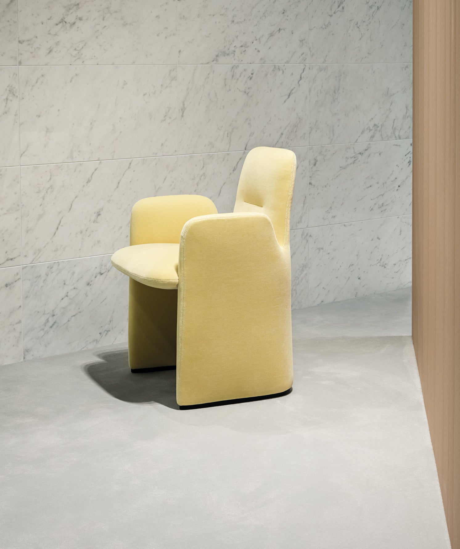
“We selected five yellows – not just the one Pantone tone”
This is precisely our point. It is time to look to Pantone’s Colour of the Year as a representation of the current Zeitgeist – the global mood, the social profile – not as a literal guide to colour trends. Pantone’s 2021 ‘prediction’, which we see as more of a summation, combines two shades 17-5104 Ultimate Gray and PANTONE 13-0647 Illuminating. Designed to work together, the pair of colours chosen for 2021 embody ‘strength and positivity’. As the name suggests, Ultimate Grey is a cool mid-grey that represents strength and a firm foundation, while Illuminating is a vivid yellow that is all about embracing brightness and cheer.

Image courtesy of Pantone
We see these colours as a representation of our united psyche. What we all experienced, in some shape or form in 2020, was a sense of despair, separation, fear and uncertainty. Grey is the embodiment of this struggle, and the restrictions and the blandness of life we faced (and indeed still face) under COVID-19. Yellow represents the human spirit, the optimism and hope that inevitably rises in the face of sadness and defeat. So grey and yellow together give us a sense of balance between struggle and success, woe and wonder, oppression and optimism.
If the Pantone Colour of the Year is designed to highlight the relationship between colour trends and what is happening in the world, we can only hope that this year’s forecast of hope and stability is more than just an educated guess.
However as Katy Kelleher, fashion writer for Vogue eloquently expressed;
“As usual, Pantone’s choice strikes me as rather tone-deaf and half-hearted, gesturing clumsily towards current events without taking any identifiable political stance. According to the company, these colours aren’t meant to stand alone; they must be presented together. It feels wishy-washy and vague. Pantone has such a great global reach, I wish it either stop trying to hitch its colour trends to current events or pick something more meaningful.”
In our 2020 Trend Intelligence we forecast key colours and explain how these sit within our Style Quadrants. This form of analysis allocates tones to key categories – Youthful, Mature, Feminine and Masculine – and in doing so creates a formula based on consumer and customer data. This formula can be effectively incorporated into product development and buying planners based on targeted research.

Pages from MC&Co Trend Colour Forecast report 22/23
Yellow featured strongly in our colour forecasts, as a stimulating, bright and joyful colour story. “It’s sunny and uplifting hues are confident, and its sprightly lighter tones are joyful when complemented by the darker tangy tones… Bright cheerful hues of yellow when used as accents can be grounded by earth and more zesty shades. Yellow is the colour to watch due to its optimistic nature. Yellow is radiant and expresses positivity and enlightenment.” We selected five yellows – not just the one Pantone tone – Pastel, Canary, Blazing Yellow, Flax and Marigold. We also featured a monochromatic palette which allows for harmony and elegance, or drama and structure. Two key grey shades – Oyster and Lead – sit comfortably with Black Iris for an eternally relevant and commercially viable stable.
Pantone’s Colour of the Year is simply a very effective marketing tool for an organisation that offers an annual reflection on society, rather than a crystal ball view of what consumers will want to buy. From our point of view, we would rather focus on basing product development ideas and purchasing patterns on trend intelligence and consumer data, not to one shape or one mood. We don’t suggest avoiding Pantone’s Colours of the Year, instead we recommend you cleverly incorporate these colour choices into effective marketing tools that express your awareness and understanding figuratively, not literally.