Top 10 Favourites from Milan

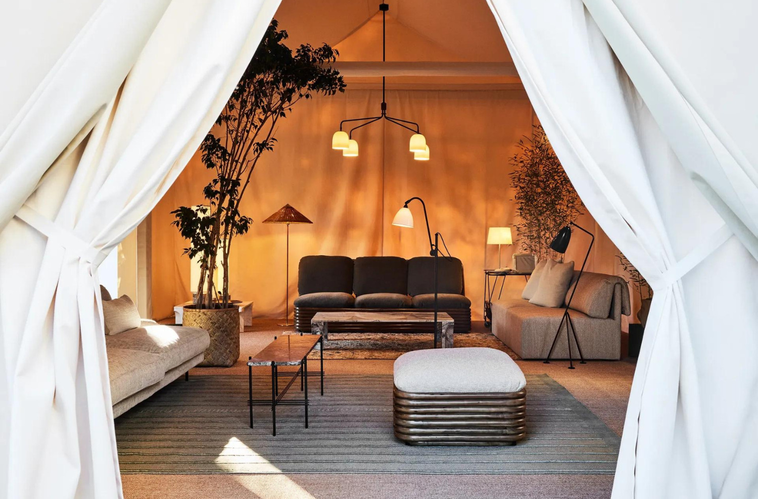
Above: Gubi
MC&Co Trend’s European correspondent and style seeker extraordinaire, Naomi Scott-Dunne travelled to the Salone in Milan recently assess the important directions from her own unique perspective on interior trends. Here are here top 10 favourite things from Milan and what they mean for design innovation holistically.
Author: Naomi Scott-Dunne

It’s often an anticlimax when a design fair wraps up, yet last month, when the World’s largest design event, Milan Design Week, ended, I left feeling optimistic, massively inspired, and moreover had a sense that design companies now seem to be fully cognizant of clients’ need for control in their lives. Throughout the week, I saw subtle nods to MC&Co’s Ambitious Approach to Life being echoed in so many products. At Salone del Mobile (which comprises of 20 pavilions, over 2000 exhibitors and occupies 210,000 square meters!) to be overwhelmed is an understatement, and this year being an “odd” year Euroluce – the lighting biennial was on – which occupied 4 pavilions, so for a lighting fan it was a real treat. Limiting my favourite finds to 10 was a challenge, here it goes:
Above: Gessi
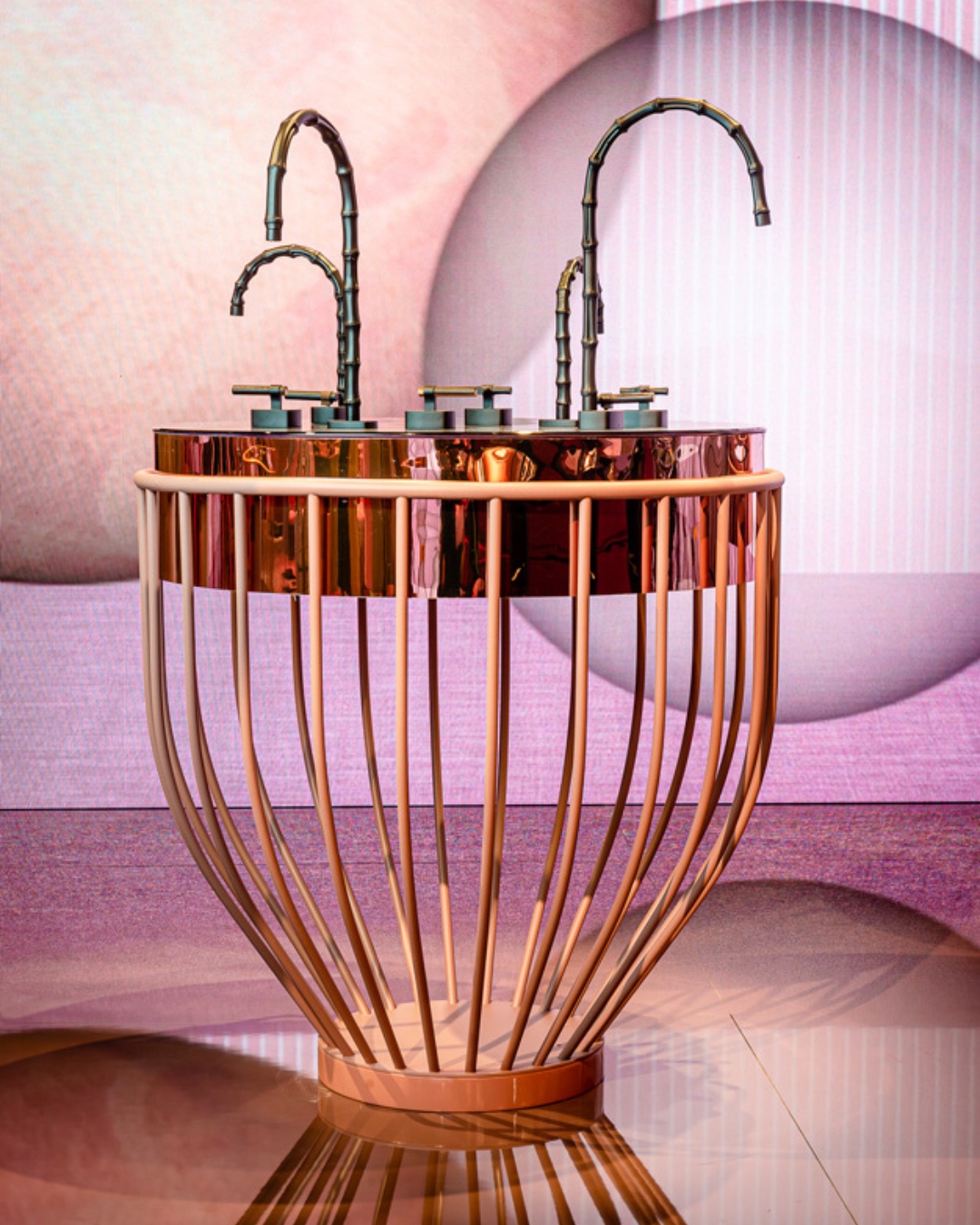
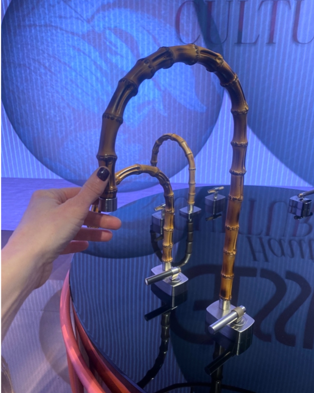
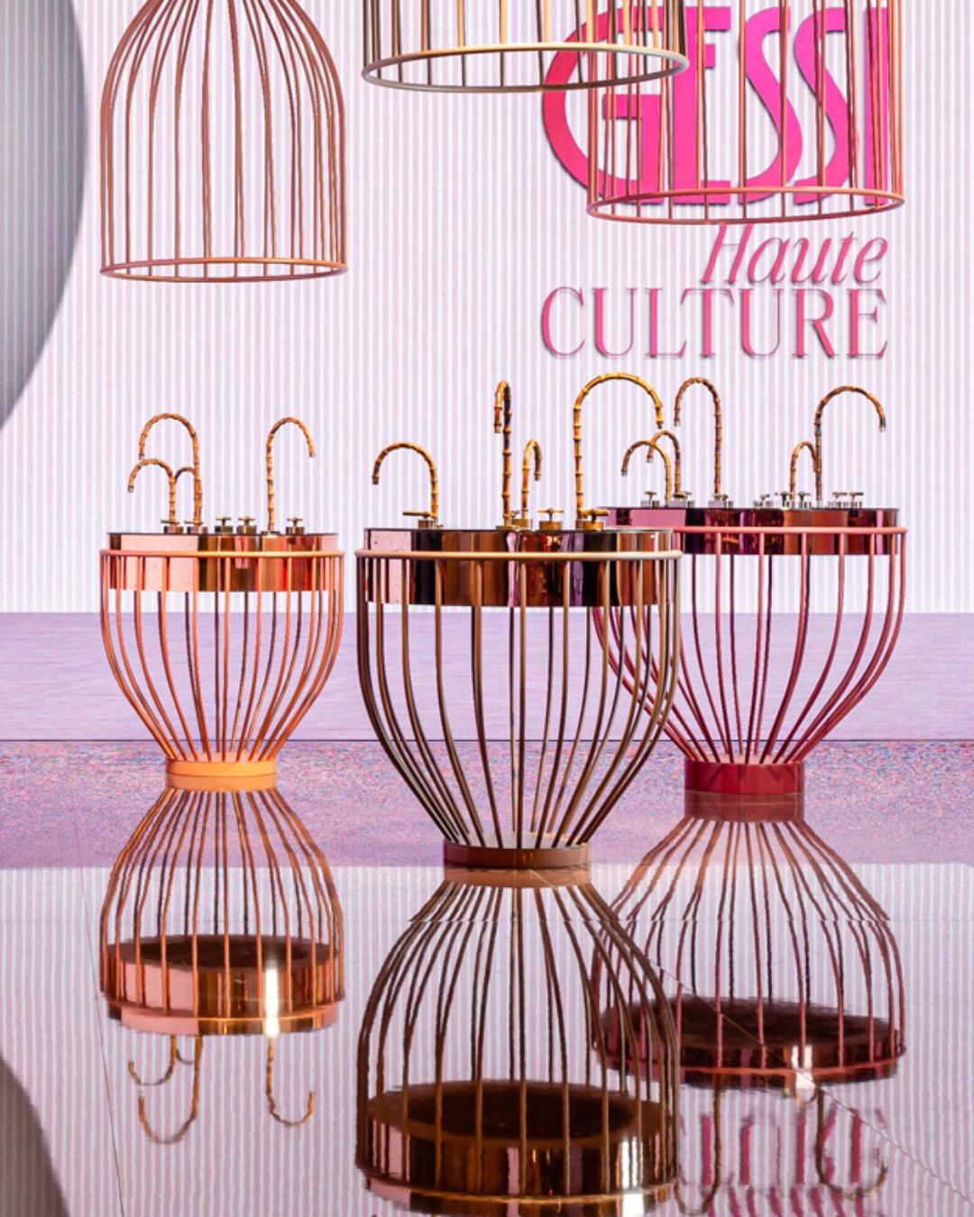
1. Sustainability is high on many designers’ agendas, and one of the most exciting discoveries for me was GESSI’s Haute Culture new launch – the Jacqueline – formed out of natural hand selected bamboo, its curvature is achieved through a heated bending purpose and the result is a divine sensory experience, talk about being at one with nature, I was absolutely obsessed with them. They will be available in several finishes – the natural and the black matte are both exquisite and can be ordered later this year; I’m certain they will become highly sought after.
Above: Horm
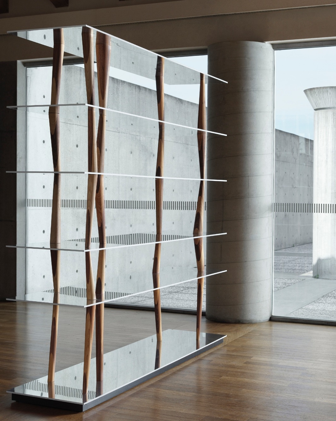
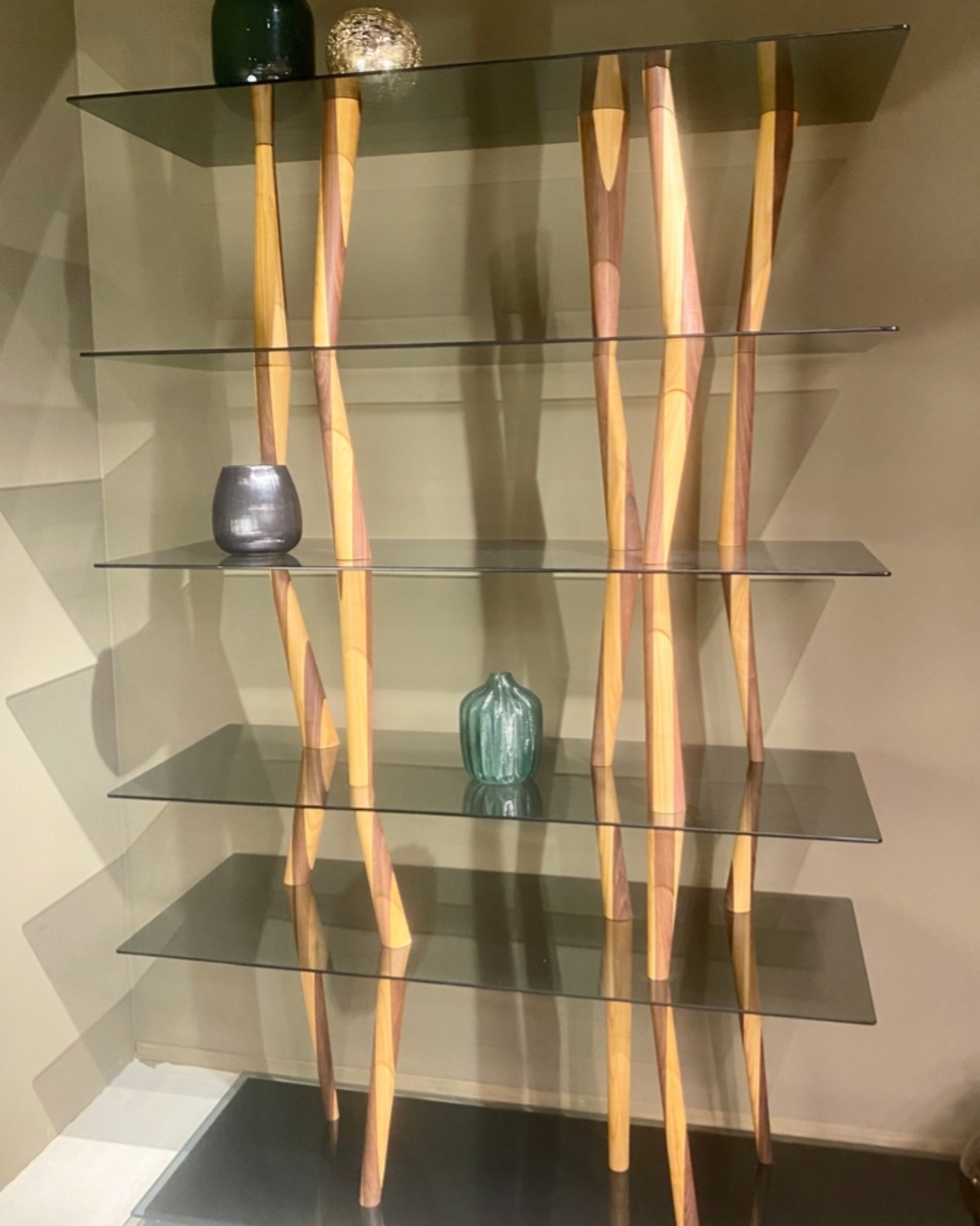
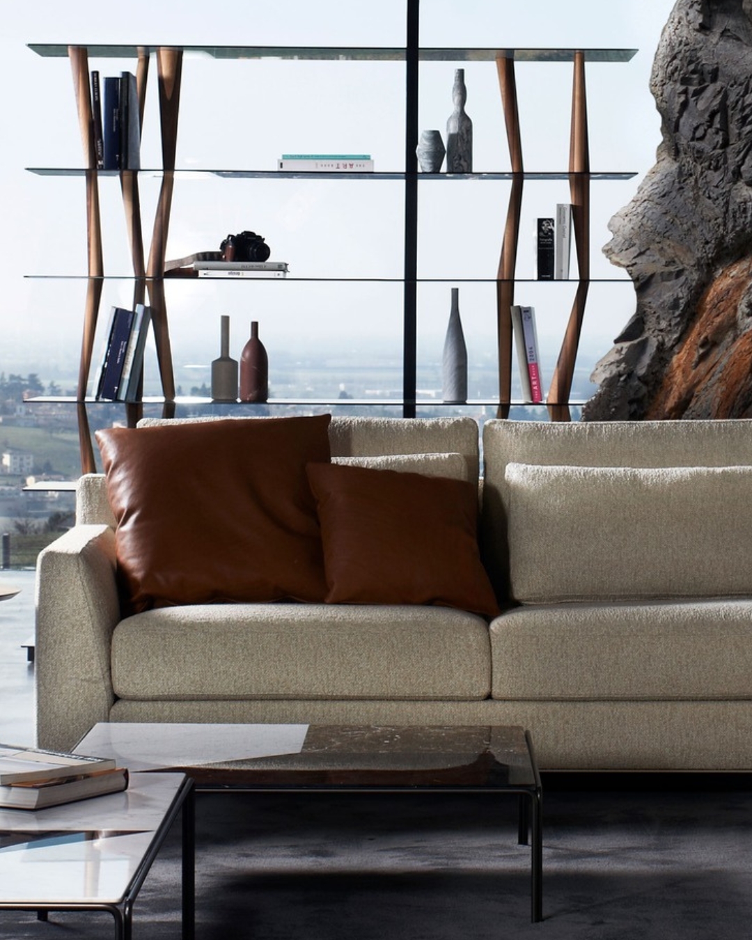
2. Many traditional design houses launched new étagères – the latest European “must-have” – echoing the trend for people to be expressive and display their personal collections; visually sharing their passions, with a sense of pride and achievement. Some were more modular, often with an integrated home bar, but there was one which particularly caught my eye: HORM’s Sendai Crystal étagère: with its 6 smoked glass shelves and irregular organic wooden supports – it has a silent sculptural presence which is quite mesmerizing and reminds me of communities living on stilts in Benin, West Africa.
Above: Prostoria
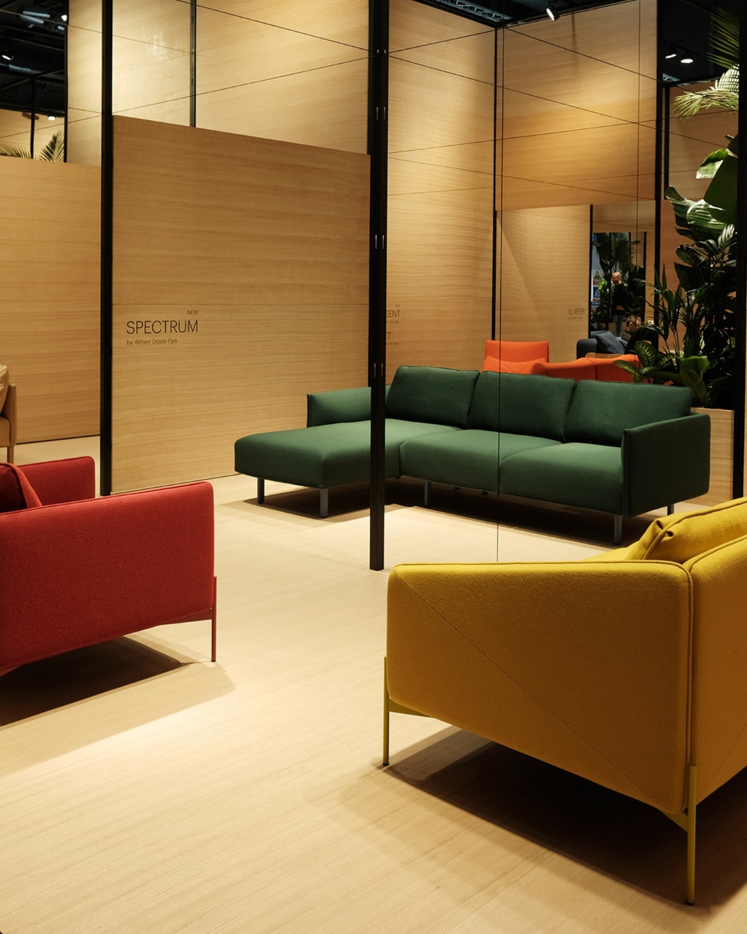
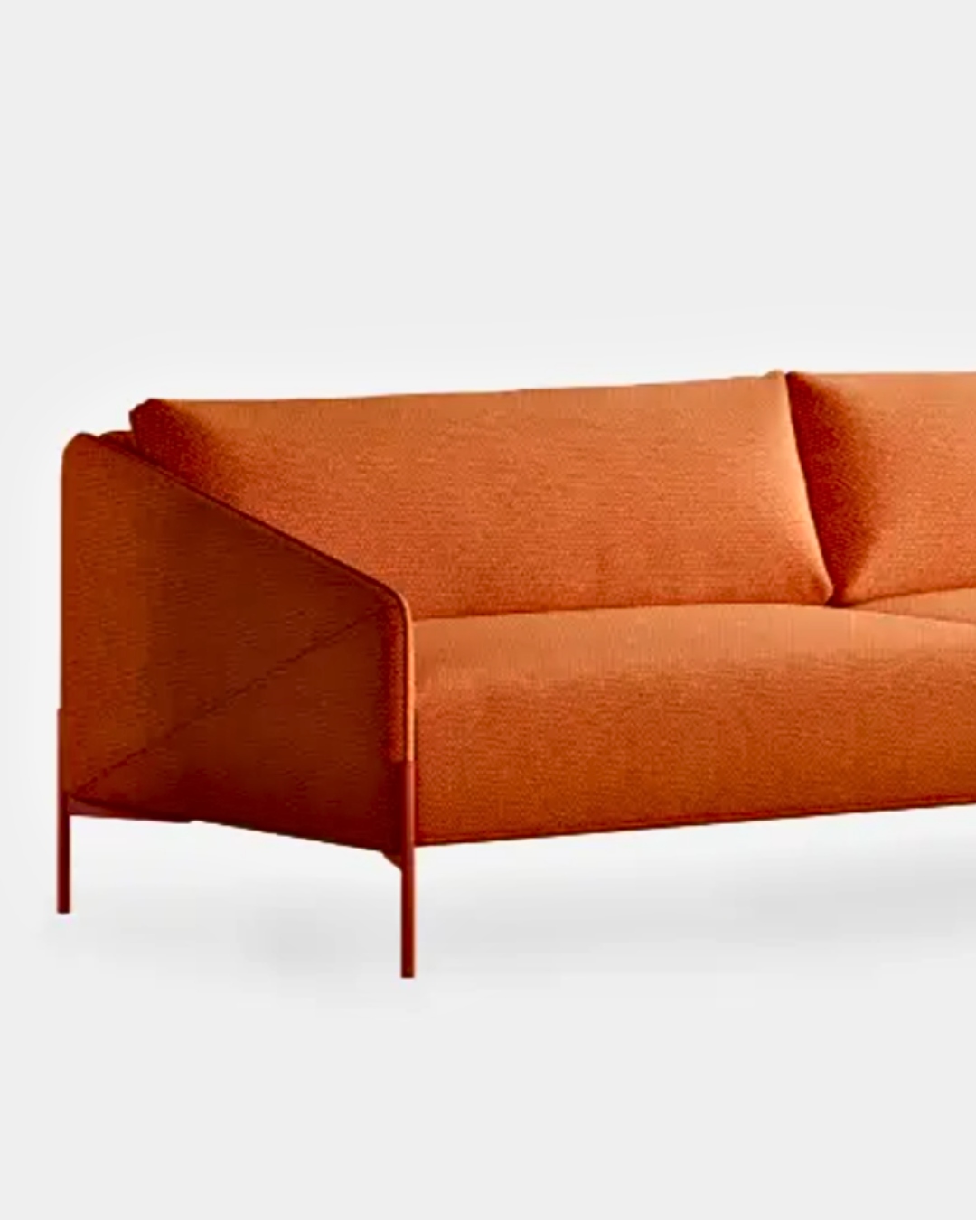
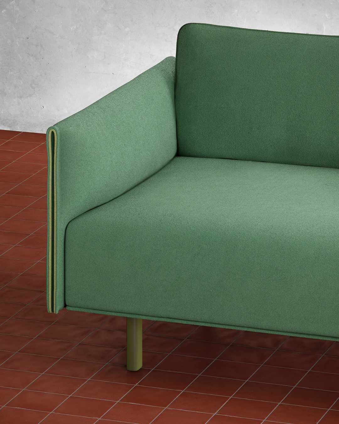
3. When it came to shapes, I especially liked the Croatian brand PROTORIA’s newly launched Spectrum Collection, designed by Altherr Désile Park, it is bold, but non-binary in form, it comes in the most delicious confident tones and was described as “a combination of simplicity paired with complexity”, and it really is. This is a remarkably comfortable and timeless collection with soft edges, thin powder-coated legs, and clever design details, watch out for this brand as they are growing in confidence and their use of colour: the richly pigmented Burnt Earth is just gorgeous.
Above: Gebruder Thonet Vienna
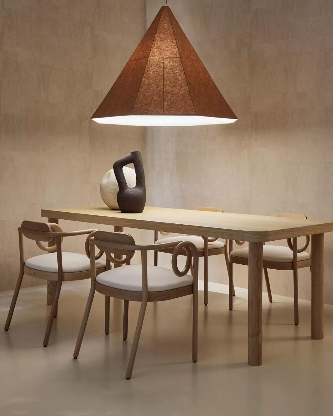
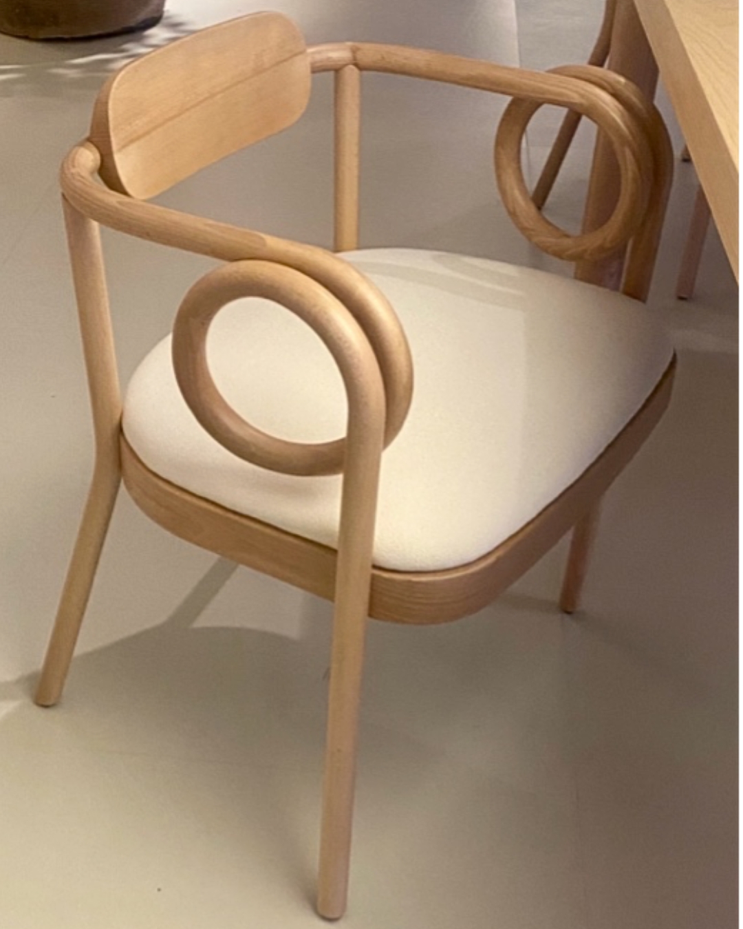
4. GEBRUDER THONET VIENNA is of course famous for the N14 – their iconic bistrot chair (sadly copied throughout the world) and they remain the masters of bent wood and woven cane: the curvature they achieve almost defies gravity. So, it’s no huge surprise that their latest collaboration with India Madhavi to conceive the Loop Dining Chair would be a showstopper. Not only is the shape of the bent wood mind-blowing, but the choice of palettes for the backrest (I saw it in a deep orange hue) and seat pad (Sunflower yellow or natural cream wool) are so good. This chair, along with its sister, the banquette chair, is ticking so many boxes, expect to see a lot more of these high-end crafted beauties. This release also features heavily in the MC&Co Trend Milan report.
Above: Loewe
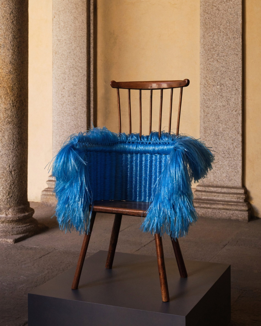
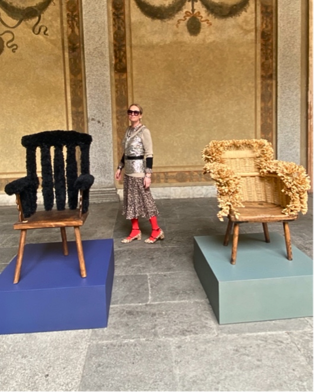
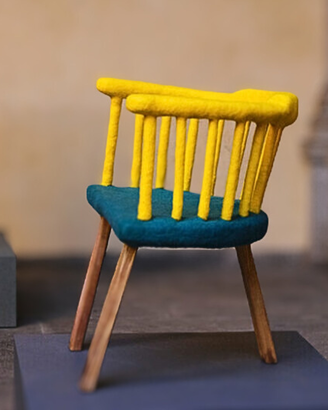
5. Undoubtedly, my favourite installation was LOEWE’s at Palazzo Isimbardi. The best ideas are always the simplest, aren’t they? Loewe’s Creative Director, Jonathan Anderson collaborated with 30 artists to inject new life into 30 wooden Shaker/Stick chairs by embellishing them with a variety of simple materials; the results were astounding, showing how a humble everyday object can be transformed into a sculptural piece of art. I must have photographed every single chair, but I’m absolutely in love with this one, and the fact that Kelly Wearstler bought one simply endorses what I’ve just said. Here I am admiring the installation.
Above: Draga & Aurel, Glas Italia
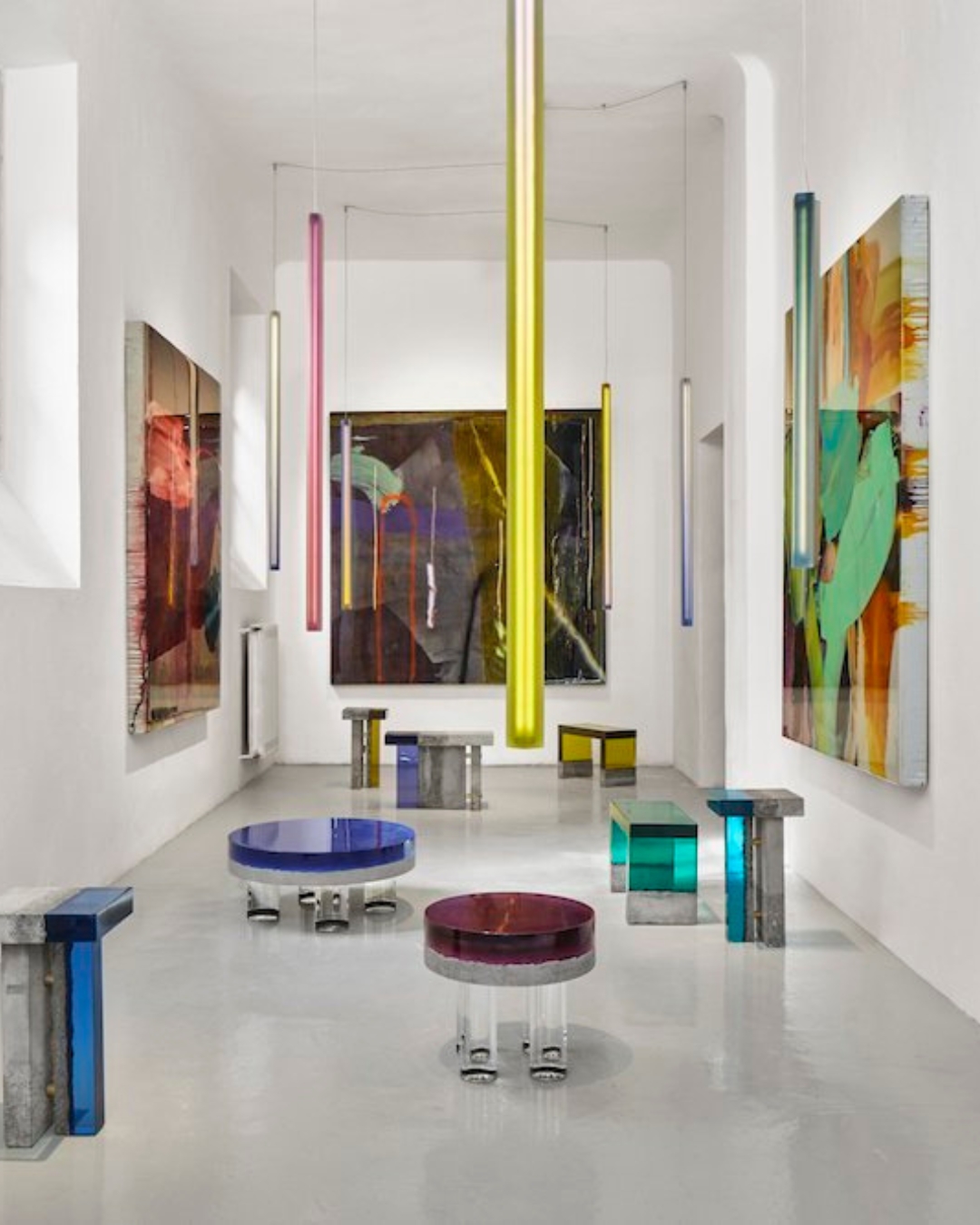
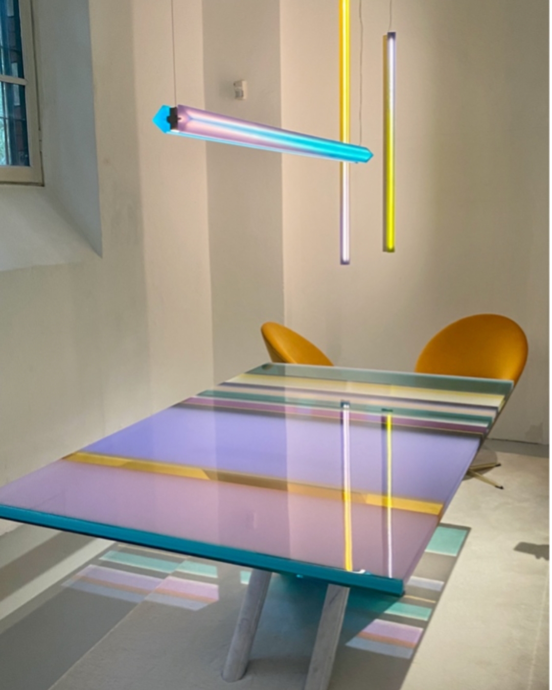
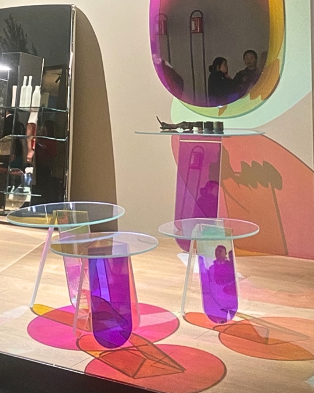
6. At almost every juncture I saw an underlying trend: transparency – be it glass, Perspex/acrylic, crystal, resin, reinforced plastics or polycarbonates, there is an appetite for all things transparent and translucent. The dynamic chunky contours of the jewel-like Baia and Golia coffee tables from DRAGA & AUREL’s Transparency Matters collection, were both sculptural and monumental and the Golia with its resin/concrete combination was brilliantly brutalist. Their Rainbow table was one of the most posted items on Instagram during the week, and the morning I visited the sun was streaming through the windows and glowed right through the table to the floor, and a magical prism-like sensation dominated the walls. GLAS ITALIA launched an iridescent mirror, console table and nested coffee table combo which I thought was playful and fun. I know the team at MC&Co Trend have been talking to you about the concept of transparency for the last year.
Above: Annibale Colombo
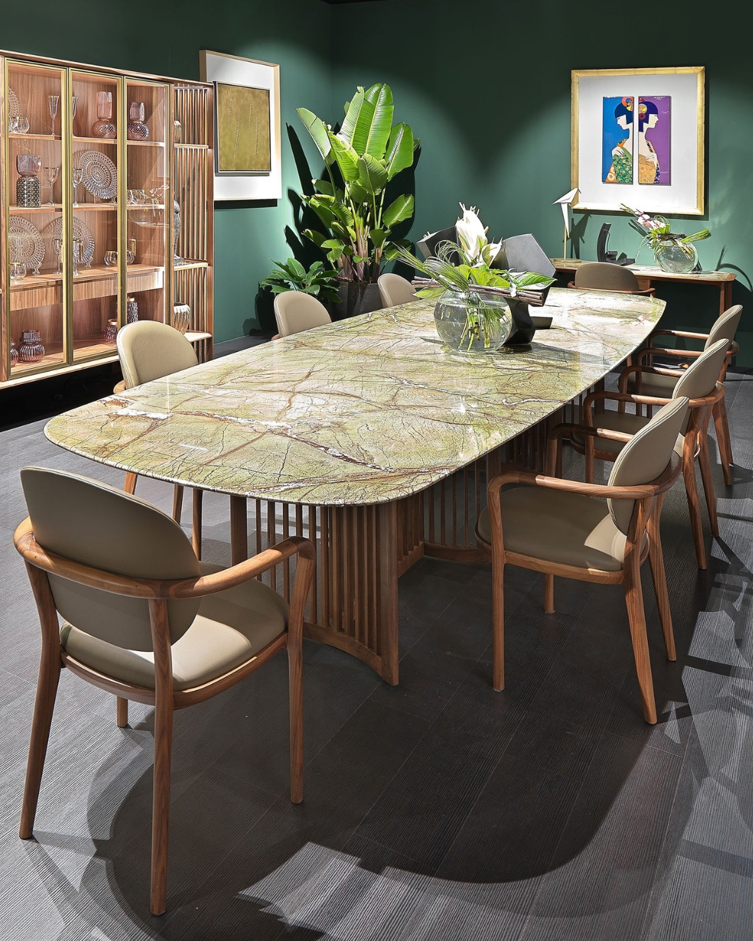
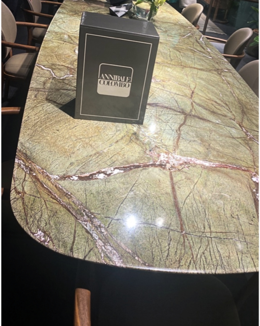
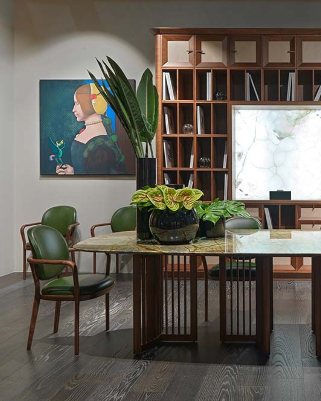
7. Italian designers are synonymous for using magnificent natural stone in their creations, and I loved seeing different iterations of marble and other natural materials being used in unexpected forms and hues. ANNIBALE COLOMBO launched the Romeo – an organic mossy hued marble rectangular table with soft rounded corners on a sculptural walnut louvred base, it was quite spectacular, the finish was called Forest Green and the brown veins paired charmingly with the walnut. Coloured marbles were present in furniture, luxury hardware and flooring and were like a breath of fresh air in all things marble.
Above: DCW Éditions
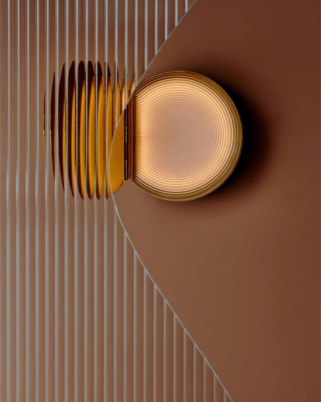
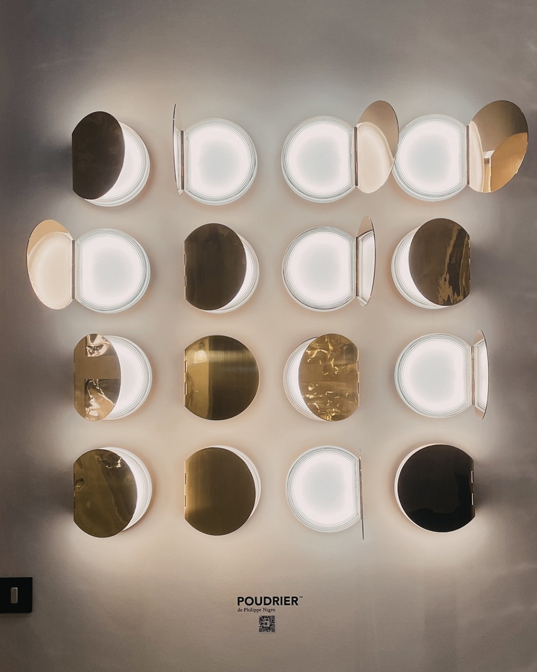
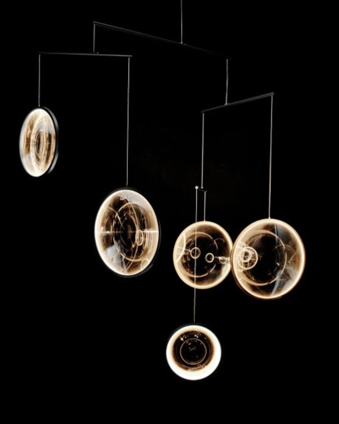
8. Reflective surfaces also played a prominent role in Milan, from mirrored light fixtures to integral oversized mirrors as part of a console table to powder compact mirrored lights. These mirrored designs are sophisticated and have attitude, again a nod to the Ambitious Approach to Life. My favourite was Poudrier by Philippe Nigro for DCW ÉDITIONS Paris and was reminiscent of my childhood when I used to watch my grandmother elegantly applying her pressed powder to her nose and forehead from a brass and mother of pearl round compact. The Poudriers luminaires were displayed in a large, impressive grid formation, but even as a row of three would create quite an impact, aren’t they lovely – maybe not demonstrating masculine attitude per se, but certainly give high-energy sophisticated vibes. DCW Éditions Paris launched FOCUS, a floating mobile-esque pendant designed by Yuji Okitsu, that transports you into an ethereal floating world and is nothing short of spellbinding.
Above: Gubi
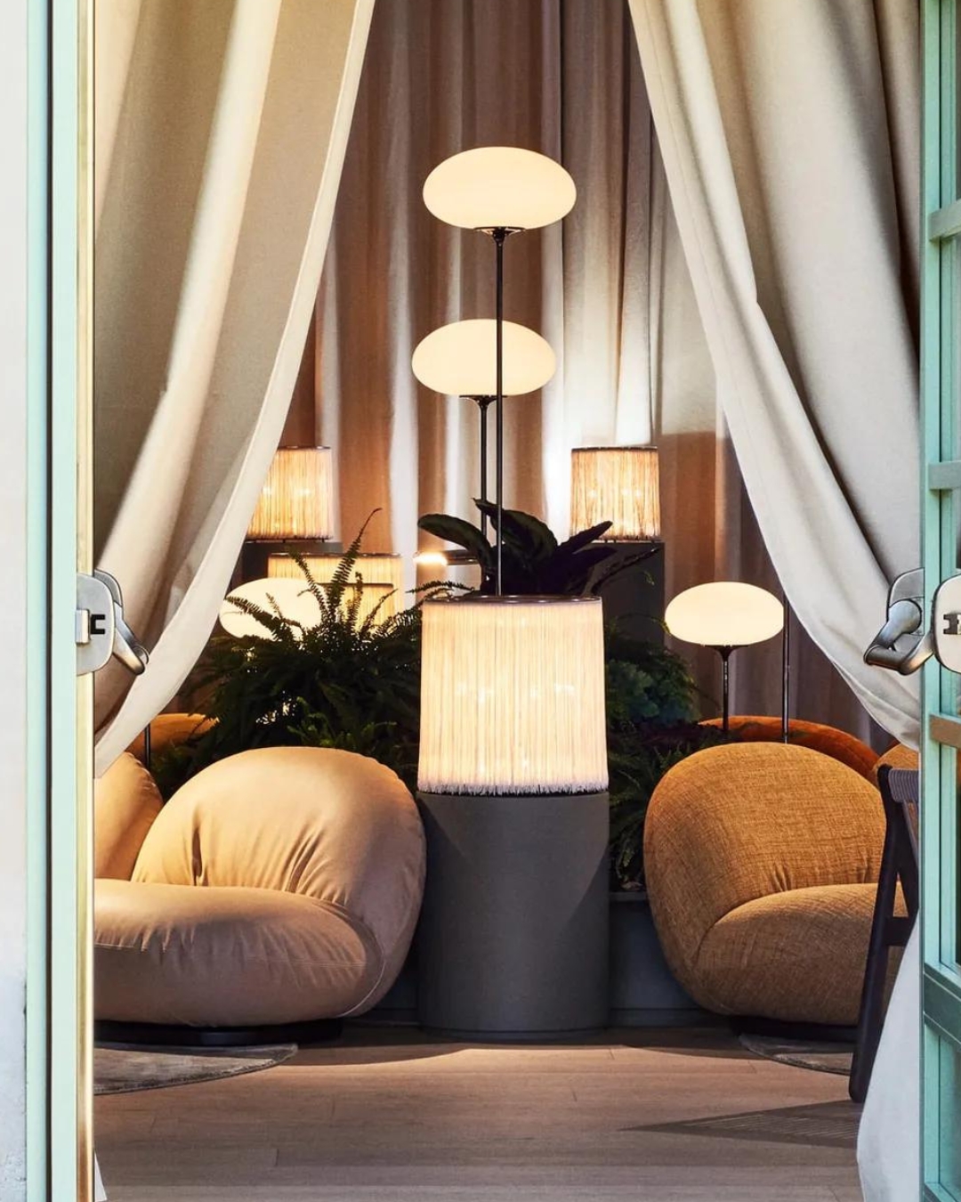
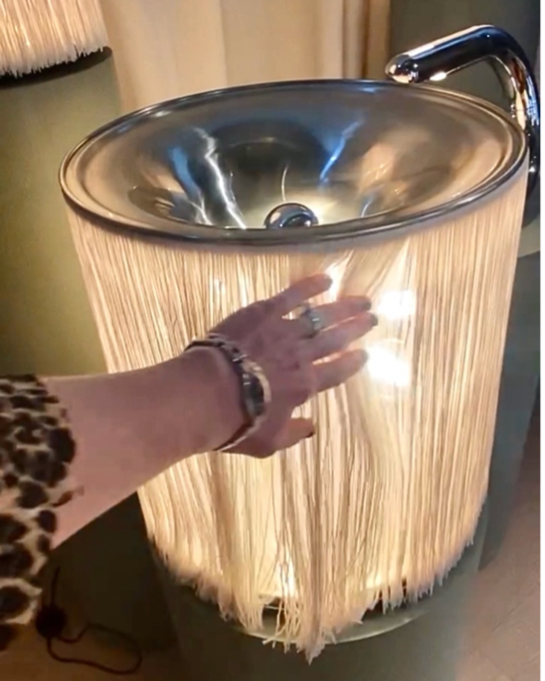
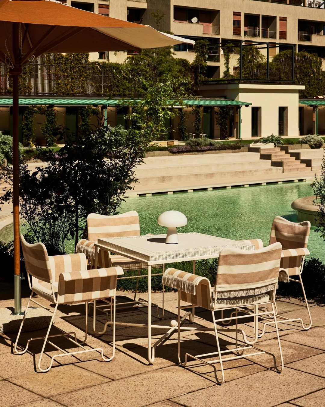
9. Passementerie made several appearances too – and I’m always partial to a tassle or two or some fringing. At GUBI’s impressive installation at the magnificent Bagni Misteriosi, the spectacular 1930s Lido played the part of a very generous host, every visitor felt special entering the complex. This fringed table lamp was truly an invitation to treat!
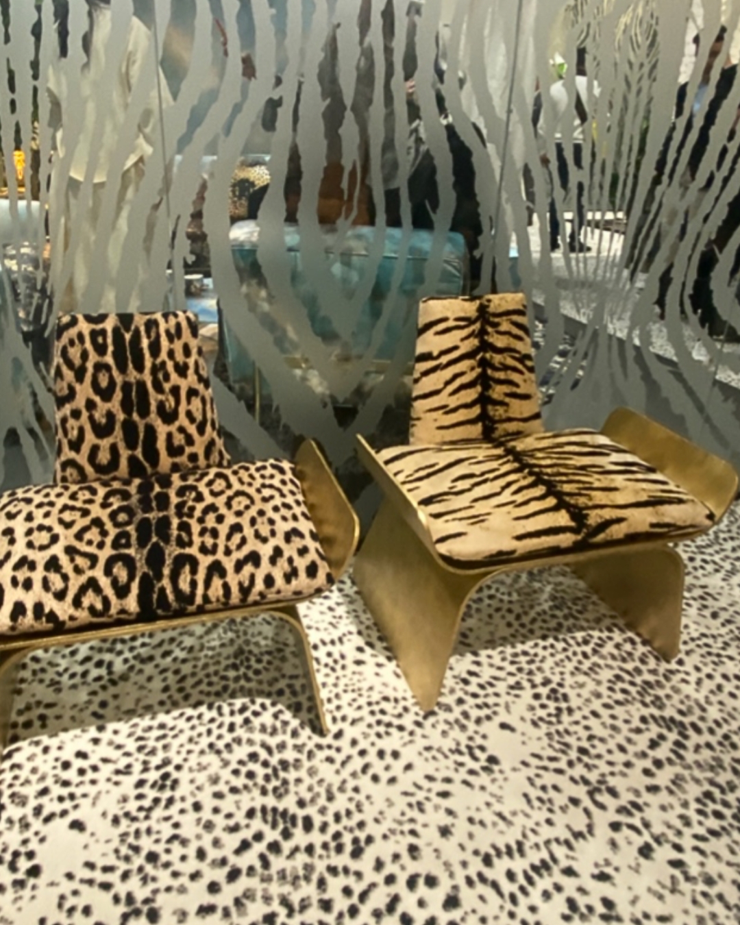
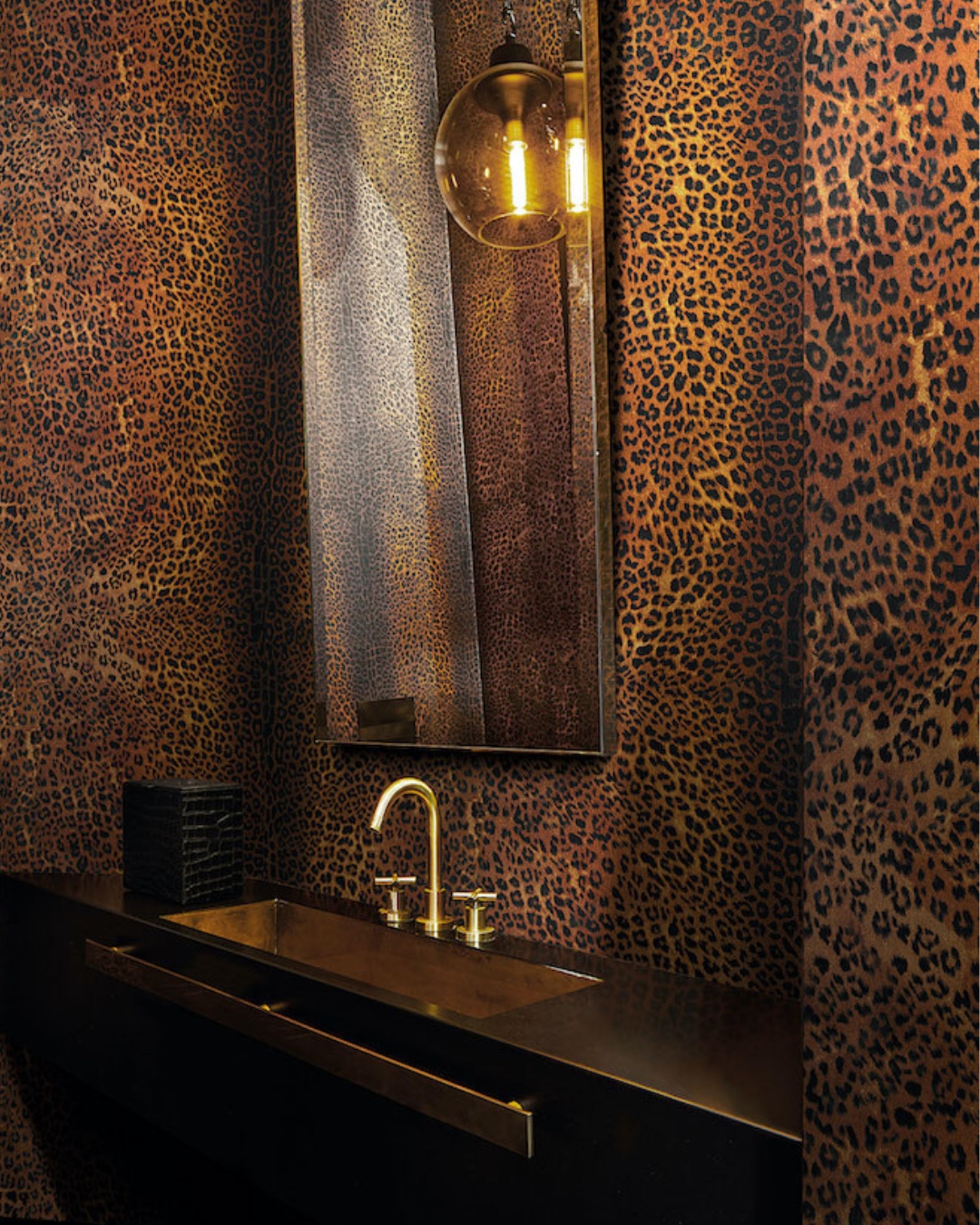
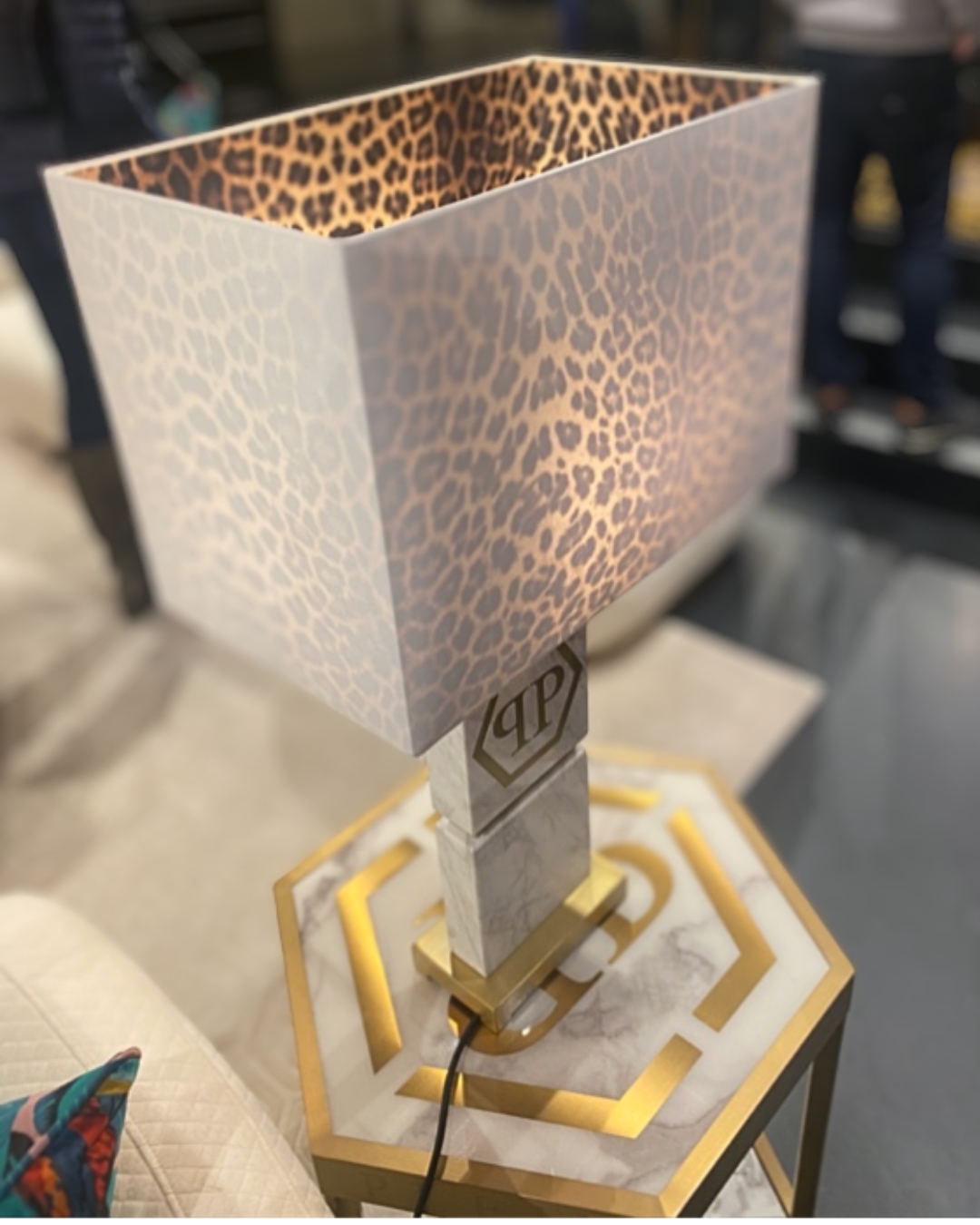
10. What better way to sign off than by having a few leopard highlights. ROBERTO CAVALLI went full out, and his stand was animal printopia with leopard, zebra and even tiger prints. PHILIP PLEIN continues to monogram everything, but he did use some divine metallic leopard print upholstery fabric on a sofa and the leopard lined white lampshades were stunning; and LONDONART Wallpaper/DSQUARED2 leopard wallpaper was just perfection.
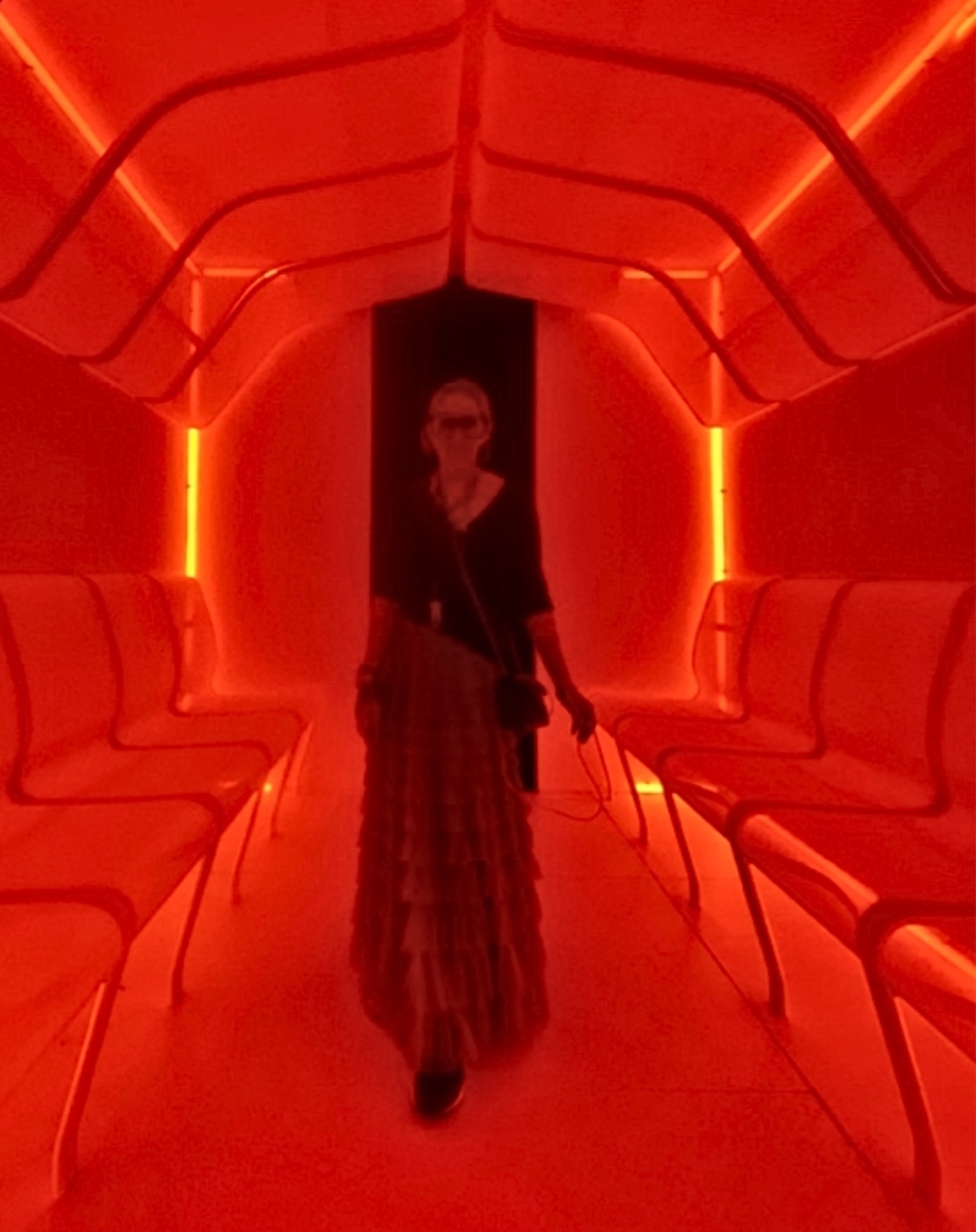
Above: Design for Good: 5ive, Naomi (me!)
With the 2023 theme of “DESIGN FOR GOOD” we were able to immerse ourselves within the vast array of installations and really explore the power of design as a conduit to foster meaningful connections and thoughts on designing the future. Sustainability was a recurring theme, yet installations such as the iconic Loewe one, made us all reflect on classic designs and whether these really need to be replaced or updated, or can they simply be embellished and elevated using unexpected materials used in an unconventional manner, or even just left as the classic items they are. What Milan made me do was really reflect on how design is beginning to evolve in this century and how respect, trust and kindness can relate to not only our human interactions, but within the design world. But please let that world be punctuated with leopard print, iridescent surfaces, innovative sustainable materials, colour drenching, reflections, unexpected marble hues and tantalizing tassels.
So that’s Arrivederci Milano! Until next time
Naomi xo
PS – Make sure you have a look at the MC&Co Trend full report on The Salone.
